Work
Project
Website Redesign
Employment
Europa Sports
Technology
AngularJS, NodeJS, SASS, ColdFusion, SQL ServerTransforming a B2B distribution platform from outdated ordering system to modern e-commerce experience
Overview
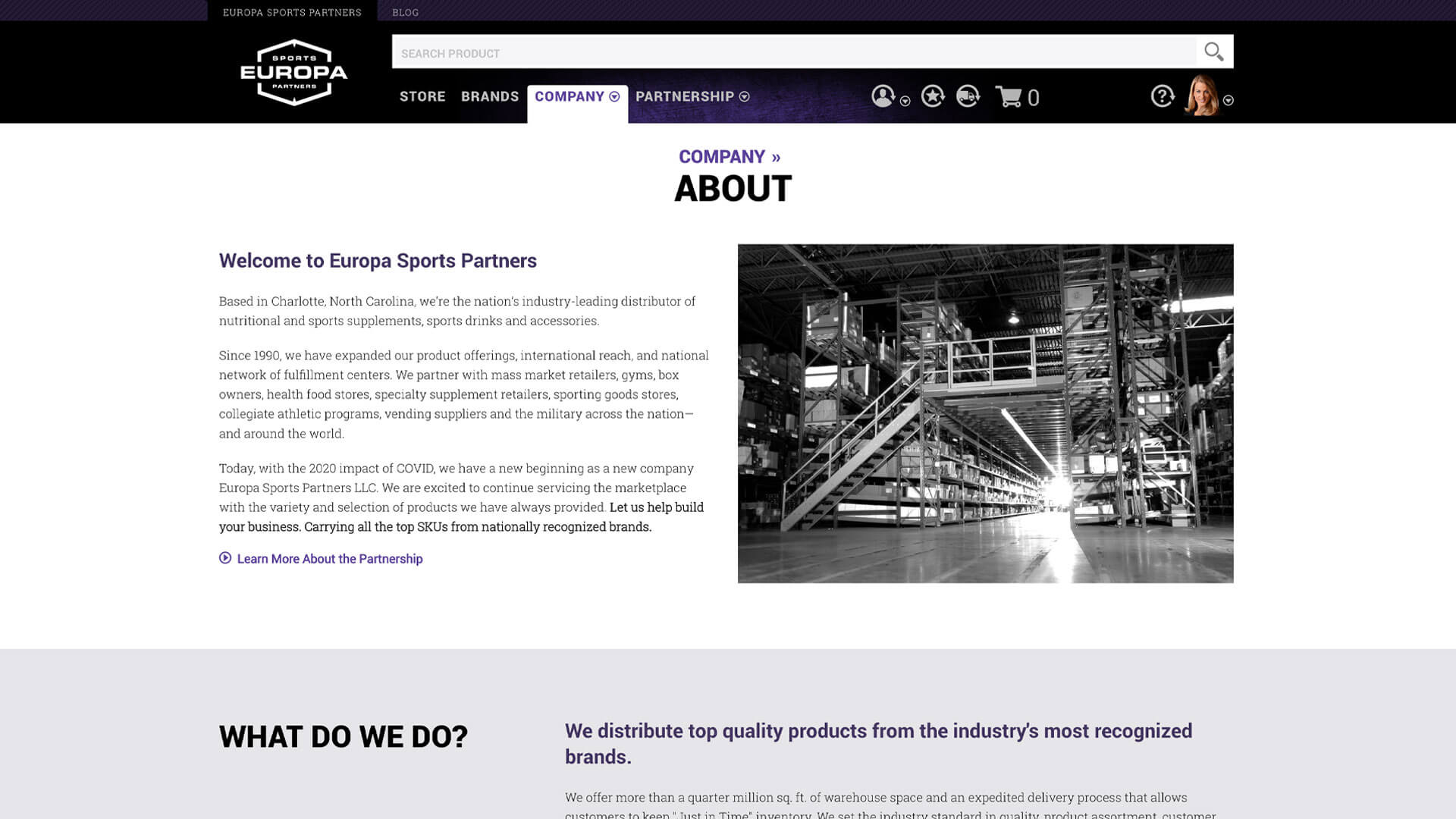
Europa Sports was the nation's industry-leading distributor of nutritional supplements, sports drinks, and accessories to businesses like Gold's Gym, Kroger, and GNC. When I joined the project, they were running on an outdated B2B ordering system that frustrated customers and consumed massive amounts of sales team time fielding basic questions and support requests.
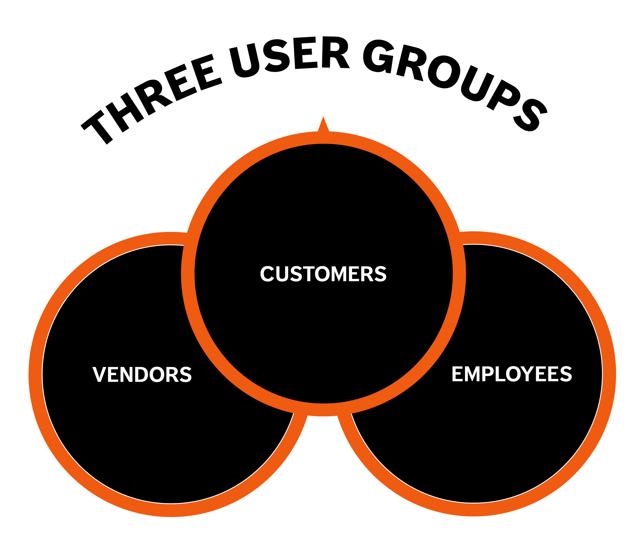
The company needed to move to a modern B2C-style e-commerce system, but this wasn't a simple storefront redesign. Europa's business model created unique complexity. Three distinct user groups depended on the platform: customers ordering products for their stores and gyms, vendors managing their product catalogs and analytics, and Europa employees running day-to-day operations. Each group had different needs, different workflows, and different expectations.
My challenge was leading the web team to redesign the entire enterprise website with a single-page application from scratch while maintaining brand integrity and serving all three audiences effectively. This case study focuses specifically on the e-commerce store and customer portal, where my design and development work had the most direct impact on business results.
My Role
Lead UX/UI Designer
Lead Front-End Developer (HTML / CSS)
-
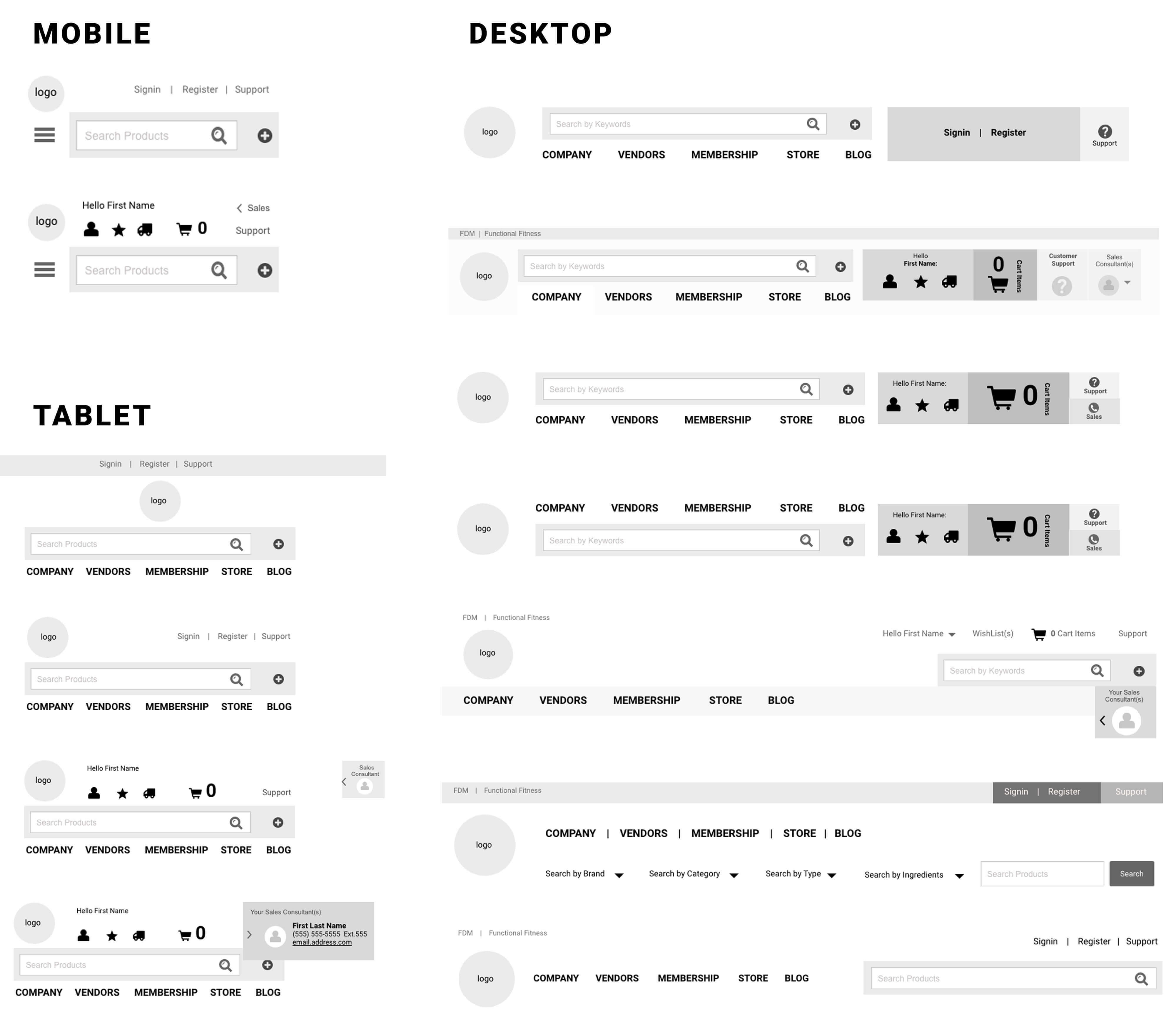
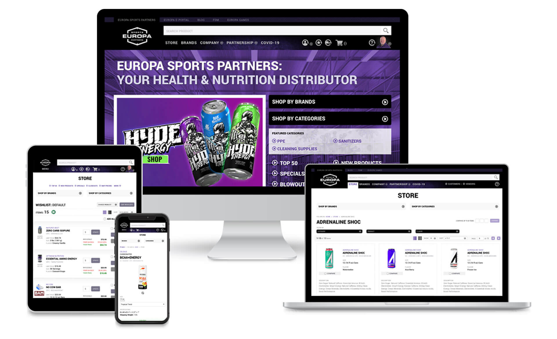
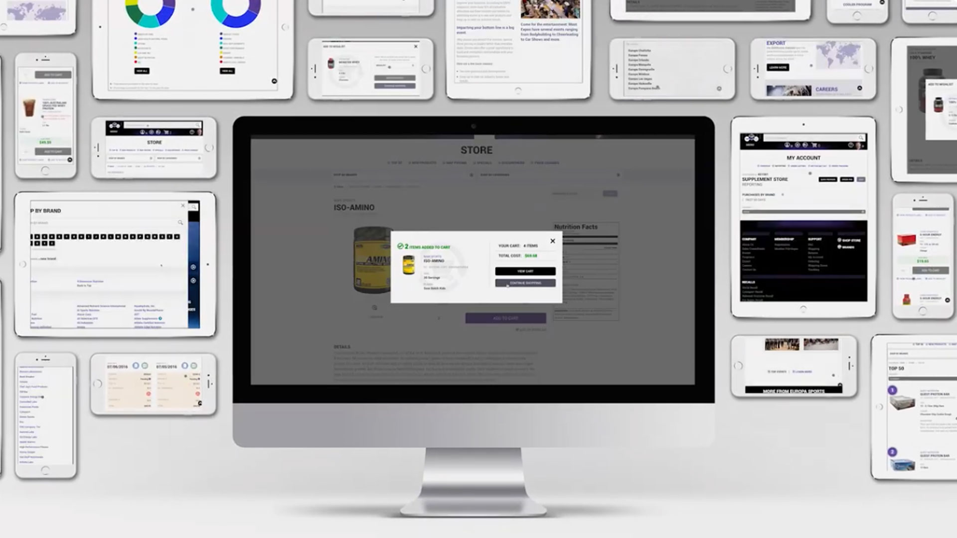
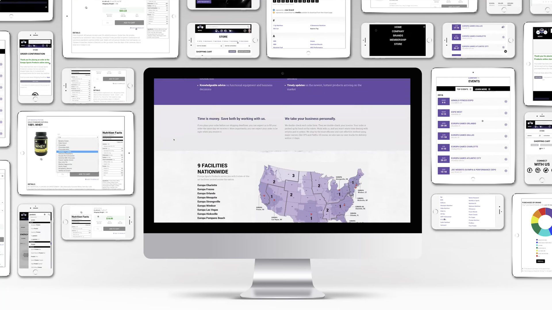
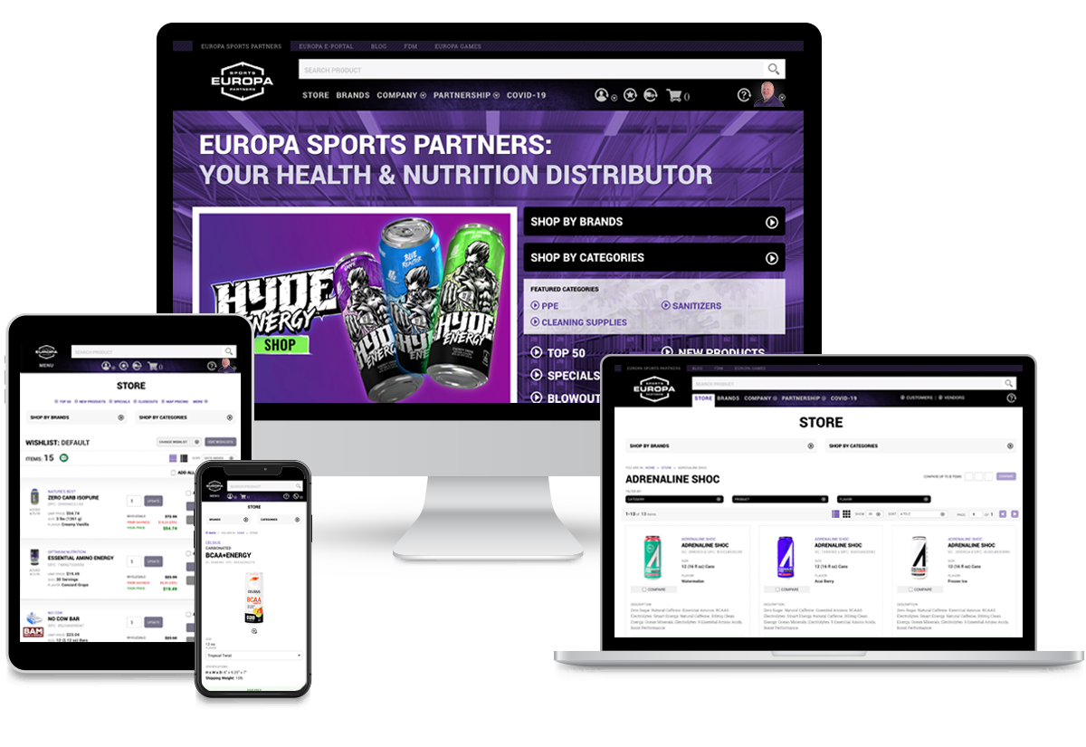 Various viewports
Glimpses of the website on mobile, tablet, and desktop.
Key Results
Decommissioned August 2025 when Prenetics closed Europa Sports.
-
45% increase in online orders after launch
-
Customer retention rate: 60% of customers continued ordering year-over-year
-
Conversion rate improvement: customers placing orders online doubled compared to the old website.
-
Feature adoption: 35% of customers used quick reorder feature regularly
The Challenge
The main challenge wasn't technical. It was understanding. I came from a B2C background and didn't have B2B wholesale distribution experience. To design something effectively, you have to understand it deeply. So before touching a wireframe, I needed to become an expert in how Europa's business actually worked.
The Business Model
Europa wasn’t a typical e‑commerce business. It was a distributor serving gyms, grocery stores, and health shops. Customers who placed large, recurring wholesale orders, not one‑off purchases. These buyers had negotiated pricing, credit terms, assigned reps, and needed tools to reorder dozens of items at once, check real‑time inventory, and review detailed purchase history. Designing for that workflow is fundamentally different from designing a consumer shopping experience.
Three User Groups, Three Different Needs
Customers (gym owners, retailers,
purchasing managers)
They needed to order products efficiently, track
shipments, review order history, manage their accounts, and quickly reorder items they'd
purchased before. They wanted a dedicated customer portal where everything related to their
business relationship with Europa lived in one place.
Vendors (manufacturers, supplement brands
like Optimum Nutrition, MET-Rx, etc.)
They needed to manage their product
catalogs, track performance analytics, update marketing materials, and understand how their
products were selling through Europa's network. They required a vendor portal with
completely different functionality.
Europa Employees (customer service, sales,
marketing)
They needed to manage customer onboarding, process orders, handle
product cataloging, post job listings, generate reports, and keep operations running
smoothly. They needed a comprehensive CMS connecting all the moving parts.
I had to understand all three to design a cohesive system, but for this case study, I focused primarily on what customers experienced: the e-commerce store and customer portal.
What Wasn't Working
The old website was a mess. The navigation was inconsistent and would completely disappear in certain sections. Content felt pieced together without logical organization. The product search was unreliable. The filtering system was confusing. The wishlist functionality conflicted with standard e-commerce patterns and made ordering cumbersome. Customers were demanding something better.
Videos
Selected videos demonstrating Europa Sports Website functionality
– The website was decommissioned after Prenectics decided to shutdown Europa Sports. –
-
 Browsing the Store
Adding Products to the cart and adding products to wishlists while browsing the store.
-
 Customer Registration
Customer has the ability to register for an account to buy products at wholesale prices, access the Customer Portal and manage their account.
-
 Customer Portal
Explore the Customer Portal where you could manage your account, order history, order tracking, and more.
-
 Search Functionality
Search for products by name, category, brand, or SKU. Customer has the ability to add product directly to cart from search results.
-
 Browsing Store
Customer journey searching for products they are interested in buying.
-
 Multiple wishlists
Customers enjoy the ability to create multiple wishlists for different purposes.
-
 Quick Reorder
Customer has the ability to quickly reorder products from their order history.
-
 Store Navigation
Customer has the ability to navigate the store and view products by category, brand, or search.
-
 Order Processing System
Order processing system for the Europa Employees to process orders submitted through the website.
-
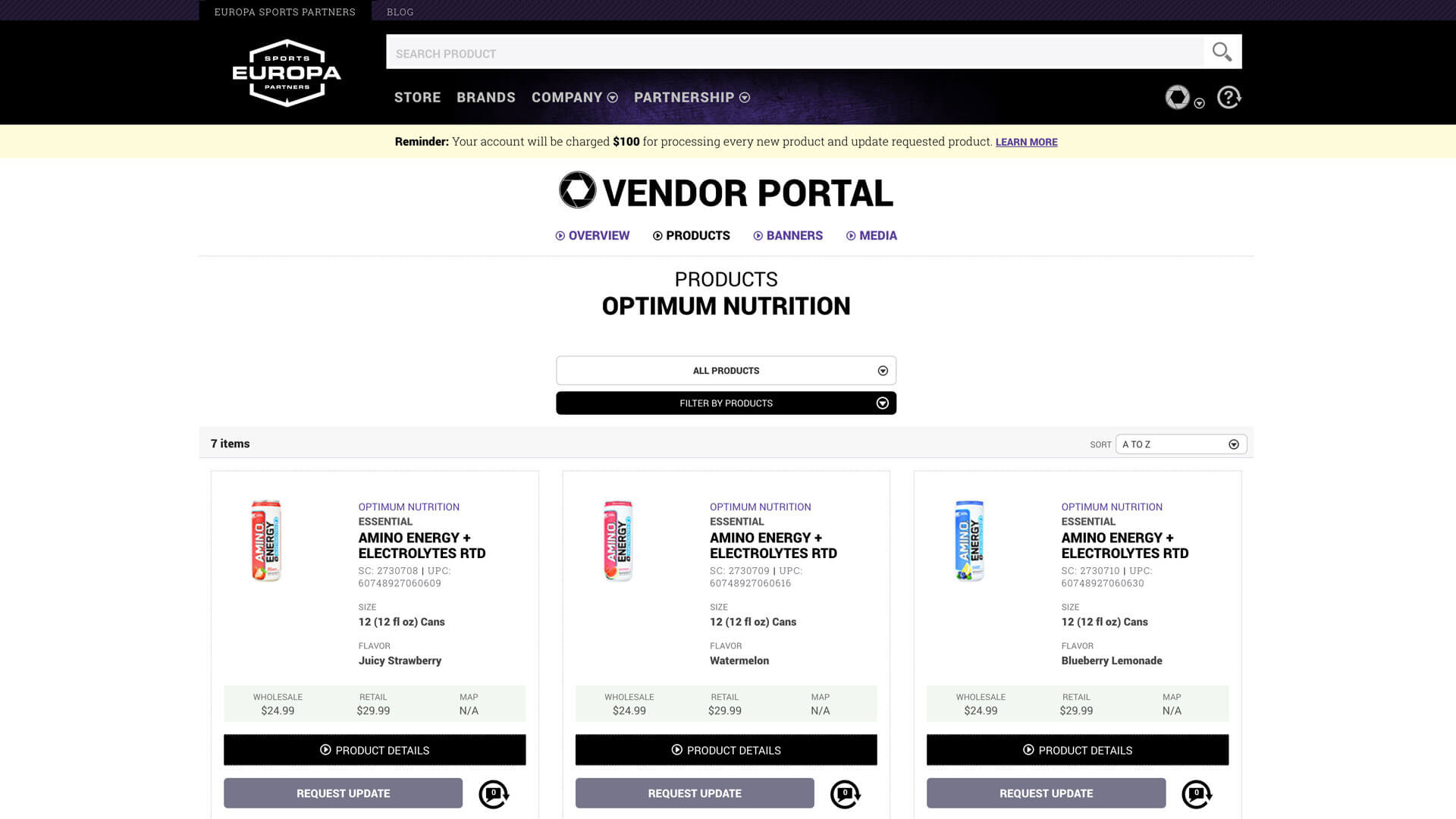 Vendor Portal
Where vendors can manage their products, product cataloging process, product performance analytics and marketing materials.
Discover
Research Approach
I started with competitive analysis, and this became the most beneficial research I did. I studied B2B platforms like Grainger, read everything I could about wholesale distribution, and worked to understand how these businesses actually operated. I needed to think like a gym owner placing a bulk order, not like someone buying supplements for personal use. The purchasing behavior, the decision-making process, the information needs were all different.
Further Understanding
I spent significant time reviewing the old website to understand Europa's history and how they'd gotten to this point. I worked with the marketing manager and copywriter to audit existing content and brainstorm ways to enhance Europa's image. We explored ideas like an interactive timeline celebrating 25 years in business and dedicated pages for each sales rep where customers could learn about them through Q&A content and social media links.
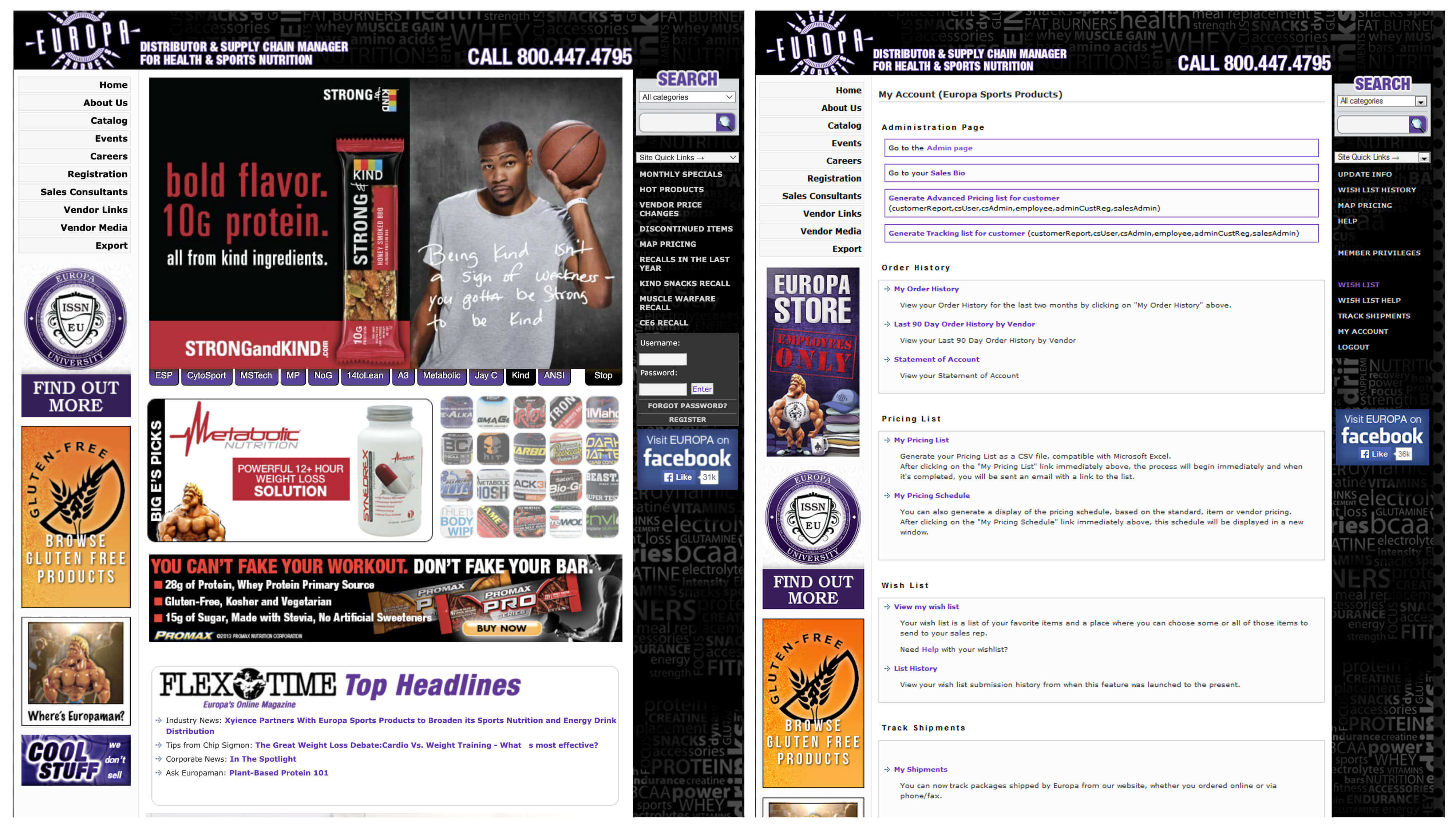
Screenshots of the old Europa Sports website
Stakeholder Interviews
The team met with different divisions across the company to understand overall objectives and expectations. We talked with marketing about content changes, branding, imagery, and the desired look and feel. We met with sales to understand customer pain points. We talked with operations about internal process needs. These conversations revealed what success would look like from multiple perspectives.
Journey Mapping
I worked with the QA team member to develop scenarios for different user types, then created journey maps with my design team for each. This exercise helped us start envisioning common user flows and understanding user motivations. A gym owner reordering familiar products had a completely different journey than someone discovering Europa for the first time or researching new supplement lines to carry.
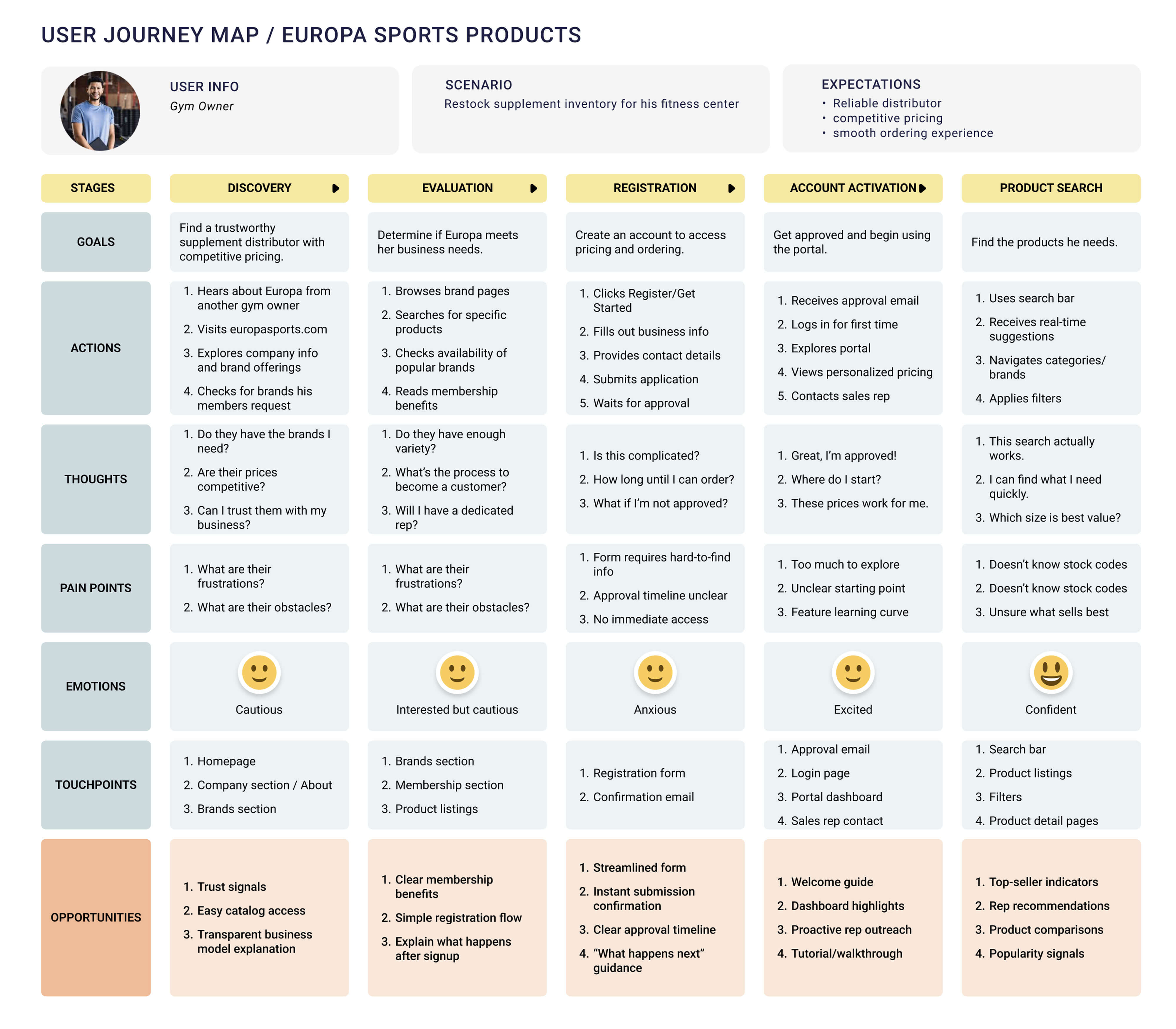
Journey Map where potential customer registers for an account
Interpret
Information Architecture
One of the biggest problems with the old site was disorganized content. I needed to restructure the navigation to group similar content and functionality together. Getting this right was crucial because the hierarchy had to be easy for users to understand and follow.
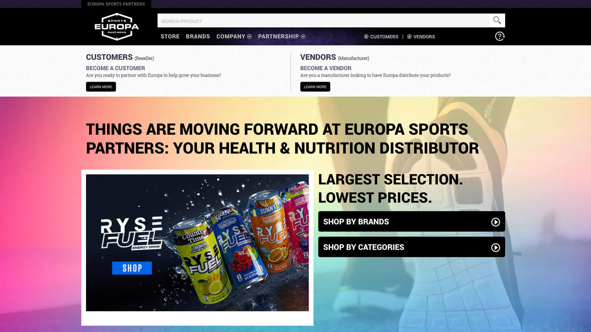
I organized everything into five main sections:
Company
Who Europa was, sales team introductions, industry
events, international distribution, careers, contact information
Brands
Centralized area for all vendor-specific information,
media, product activity, specials, MAP pricing, recalls, new products, discontinued items,
links to vendor websites
Partnership
Marketing to prospective customers & vendors.
Registration form that determined user type and presented appropriate questions.
Store
All e-commerce and shopping experiences
Support
Centralized help information, FAQs, customer service
contact
This structure meant the main navigation would always be accessible in the header no matter where users were on the site. No more navigation disappearing when viewing products or switching sections.
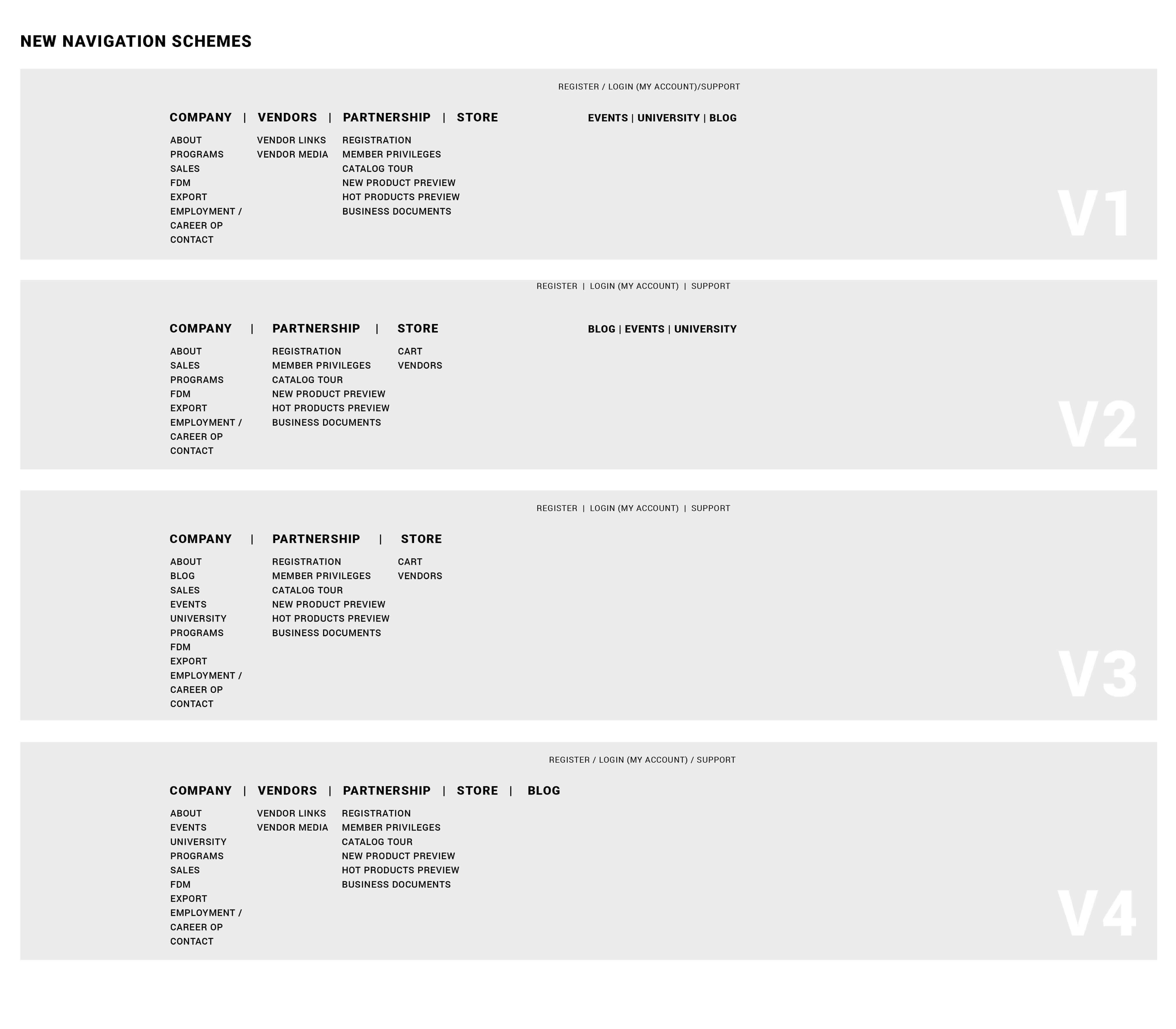
Experimenting with different navigation layouts and information architecture
User Flows
I used low-fidelity wireframes to map user flows between different sections using the new navigation. It was crucial that customers could easily understand where they were and how to move around. The store needed to provide easy ability to shop, manage accounts, and explore new products without getting lost or confused.
Sample of wire-frames exploring User flow for different navigation layouts
Solve
Designing the Experience
Wireframing
I made sure the design team spent adequate time wireframing structure, content, and functionality before jumping to visual design. I created initial wireframes to define patterns, layouts, and hierarchy. We had multiple daily meetings reviewing wireframes to ensure we were aligned and moving forward with solutions for all user needs. We met with stakeholders regularly to review progress and gather feedback.
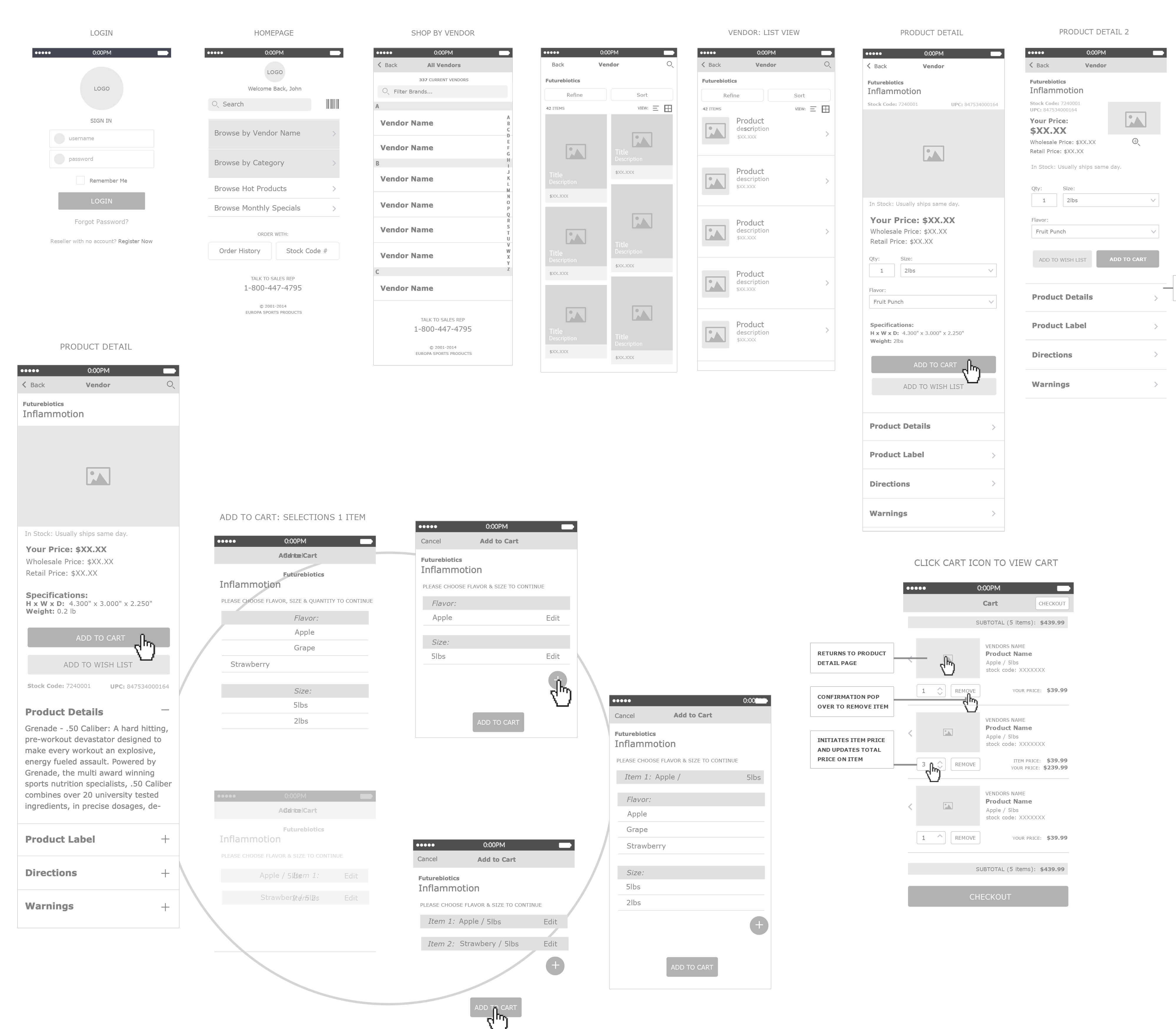
Example of wireframes for the Europa Sports website
Prototyping
We didn't prototype every screen, but we built interactive prototypes for complex experiences like the store. Having stakeholders and team members click through the experience before development ensured the product was intuitive. We wanted to fully understand how customers would experience and use the store before committing to the build.
The prototypes also helped the development team understand exactly what we were building so they could structure the single-page application architecture correctly and provide the right data flows.
Visual Design and Branding
The Design Challenge
Stakeholders didn't have a clear direction for look and feel. Europa had a strong brand translated primarily into print and marketing materials with a grunge edge, but we didn't want too many grunge elements distracting from functionality. My job was designing a website brand with just the right amount of graphical elements.
I produced three to four full high-fidelity mocks with varying looks and feels. I worked closely with the Chief Marketing Officer and design team to nail down the design that best represented Europa without compromising usability.
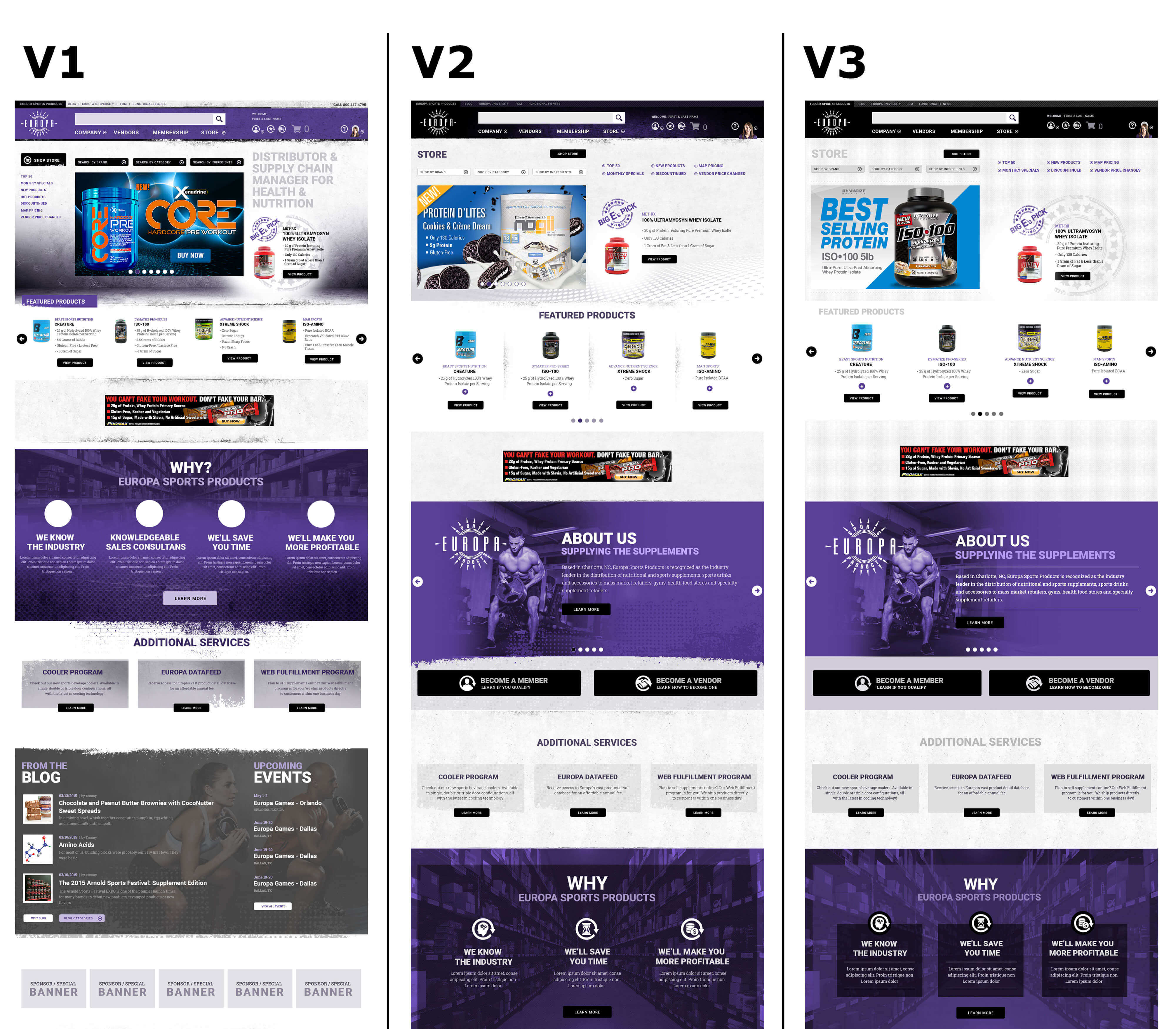
Sample of high-fidelity Landing Page mocks for the Europa Sports website
Two landing page designs that were live for various time periods.
Establishing Design Language
Once we had approval on the high-fidelity mocks, I extended the design across all pages and sections with help from the design team. As designs evolved, patterns and UI components took shape. We formulated a design language establishing visual and interactive rules: colors, typography, icons, imagery, spacing, interactions.
Having a cohesive design system meant consistency across the massive site and made future development faster as we continued adding features over the years.
Key Design Decisions
Several design decisions shaped the entire experience:
Responsive
We built mobile-first, ensuring consistent experience across smartphones, tablets, laptops, and desktops. Mobile usage was increasing, and a responsive approach meant one codebase and easier maintenance. More importantly, it meant gym owners could place orders from anywhere, not just their office computers.
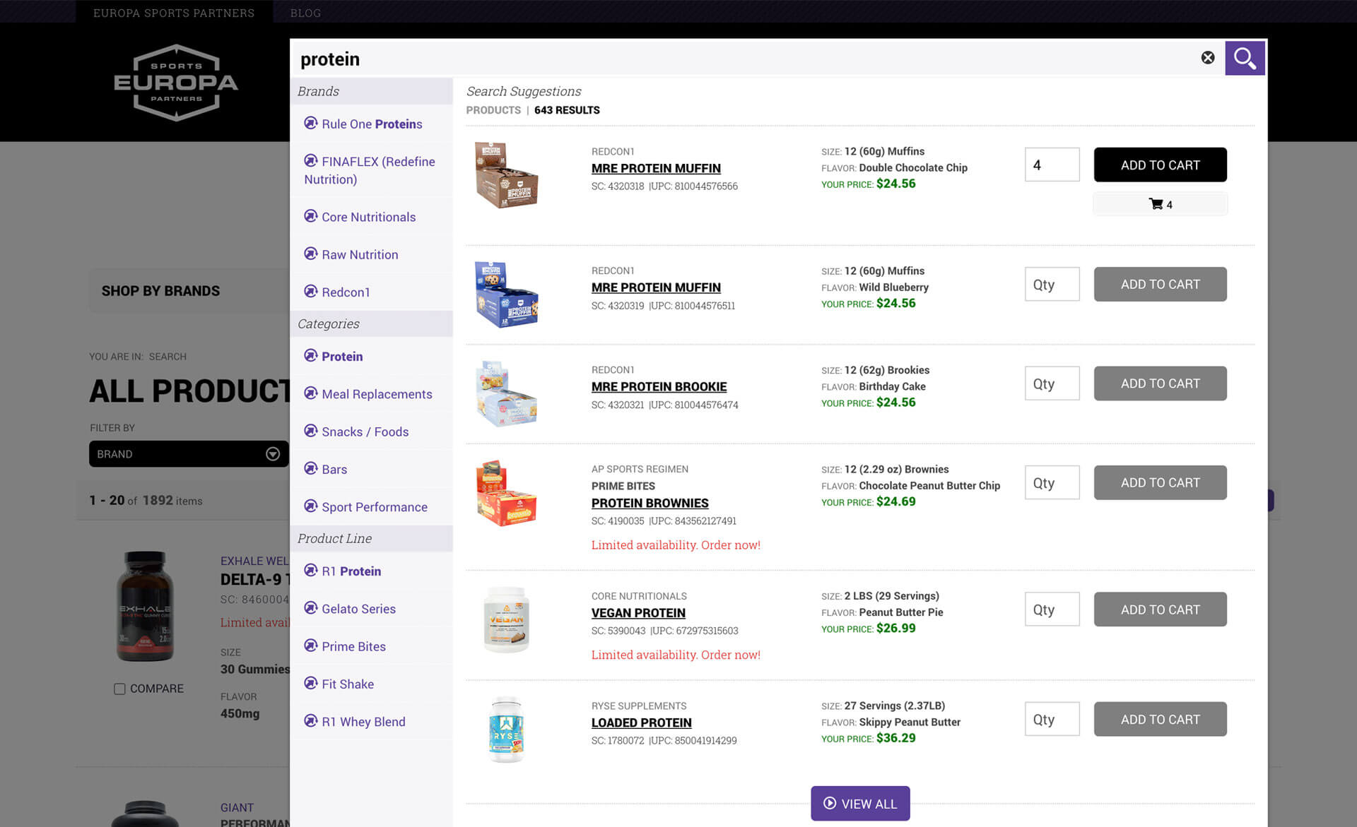
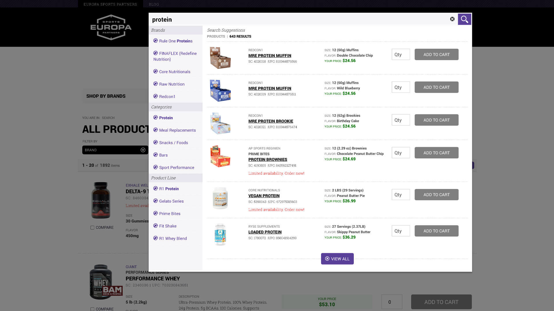
Intelligent Search
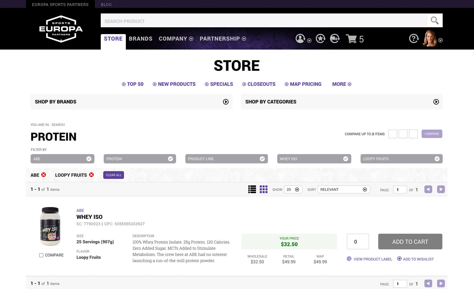
The old site's product search didn't work, and search is arguably the most important function of an e-commerce site. We designed a sophisticated search bar with type-ahead suggestions organized by brands and categories. As customers typed, they'd see real-time suggestions helping them find products faster.
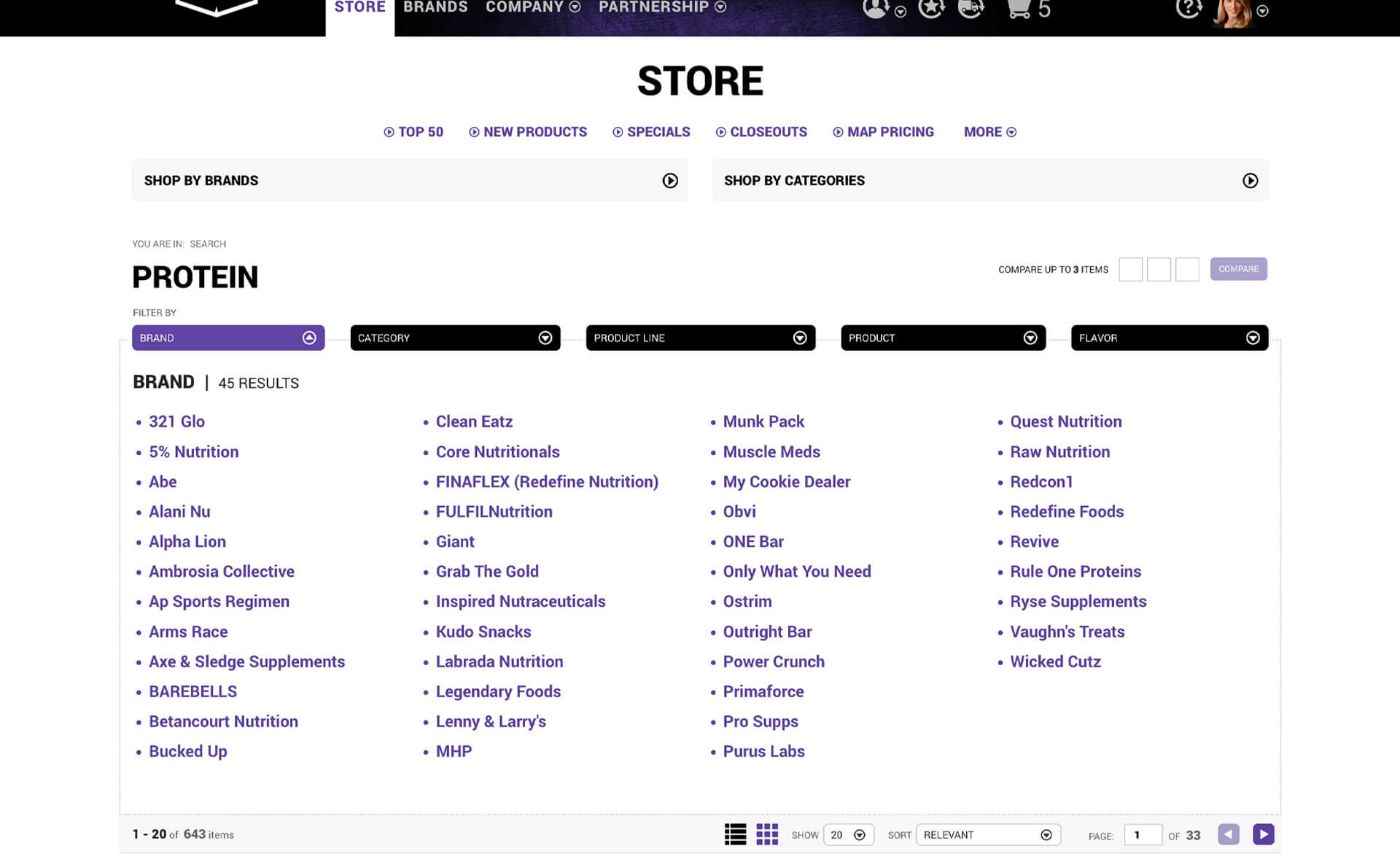
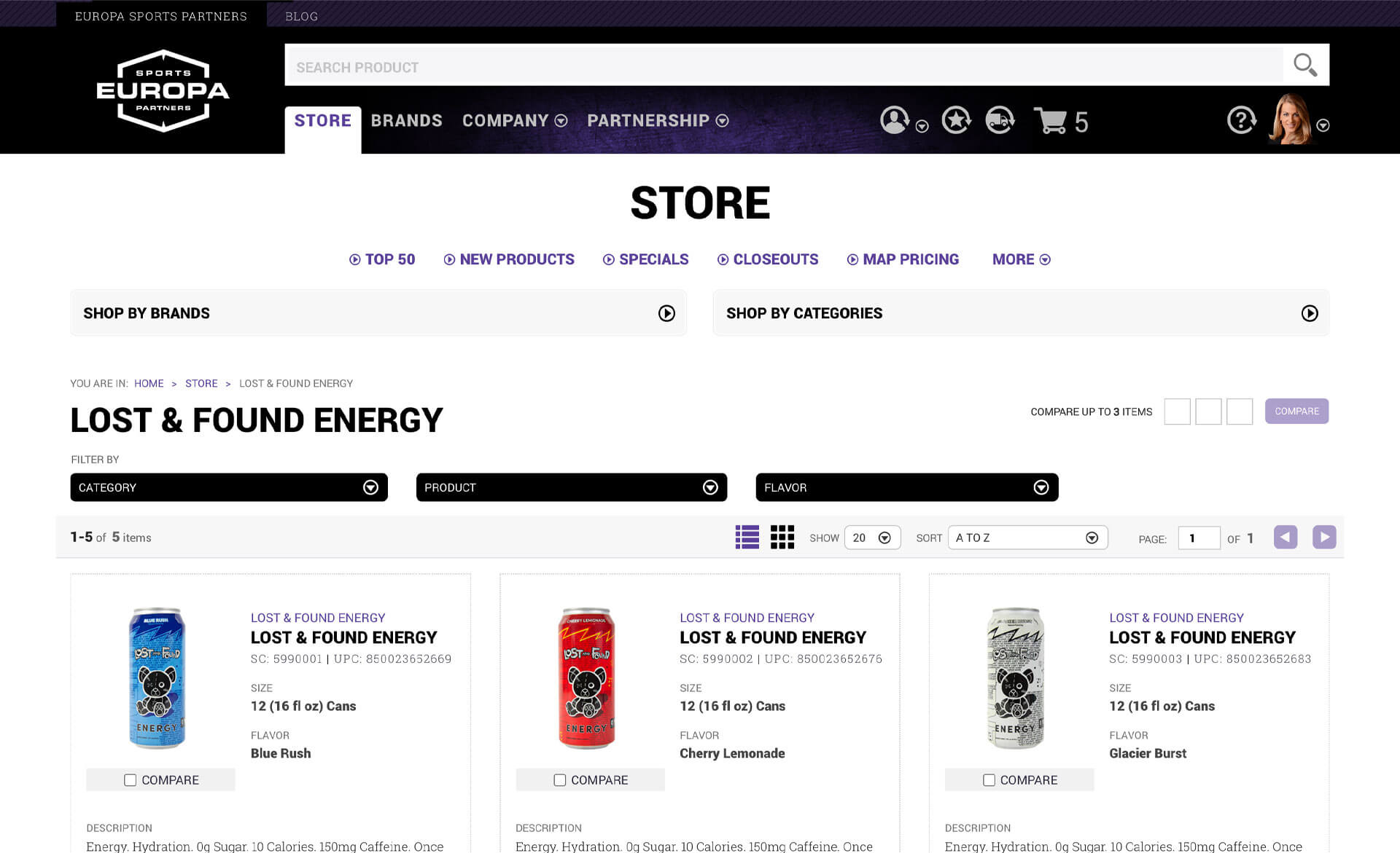
Simplified ProductFiltering
Single-click filtering options let users drill down from thousands of products to exactly what they wanted. Filter by brand, category, product type, or flavor. The old site made this nearly impossible. The new system made it intuitive.
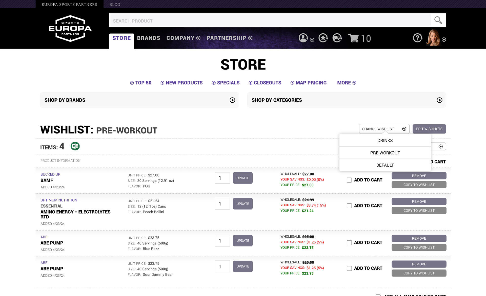
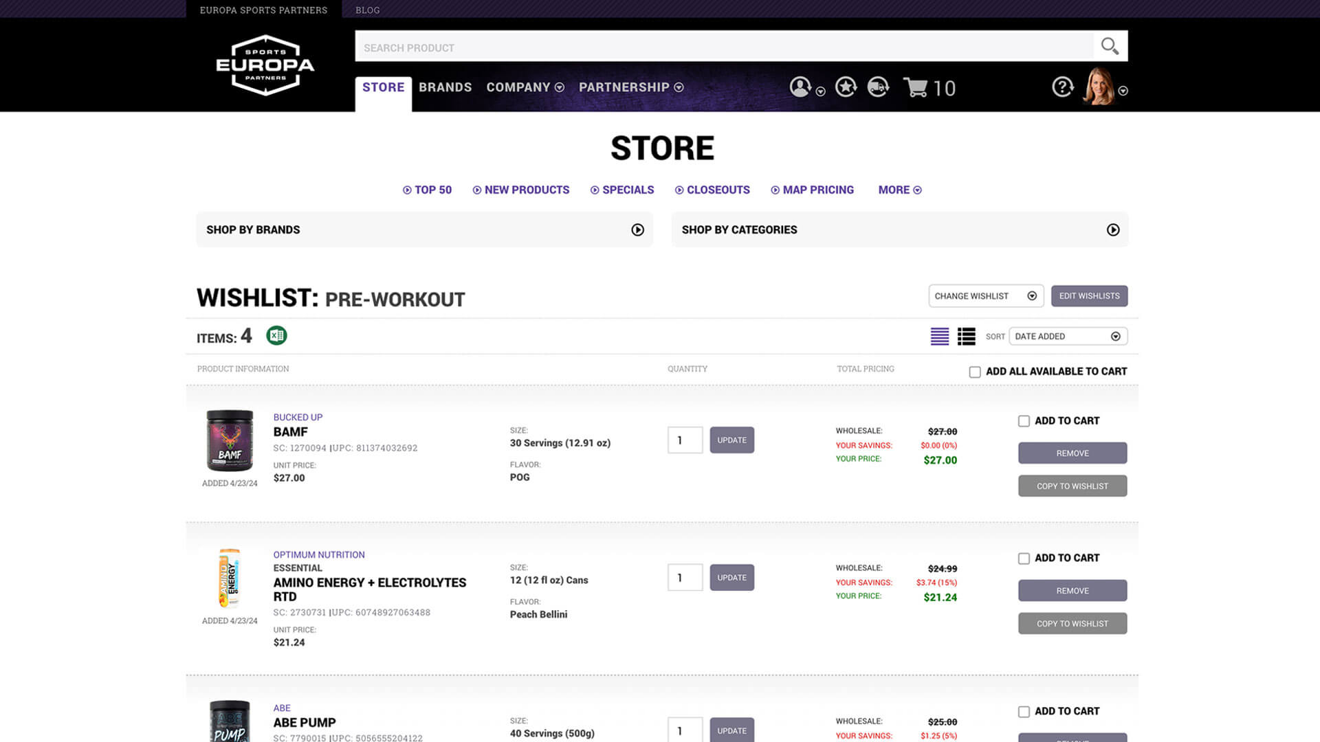
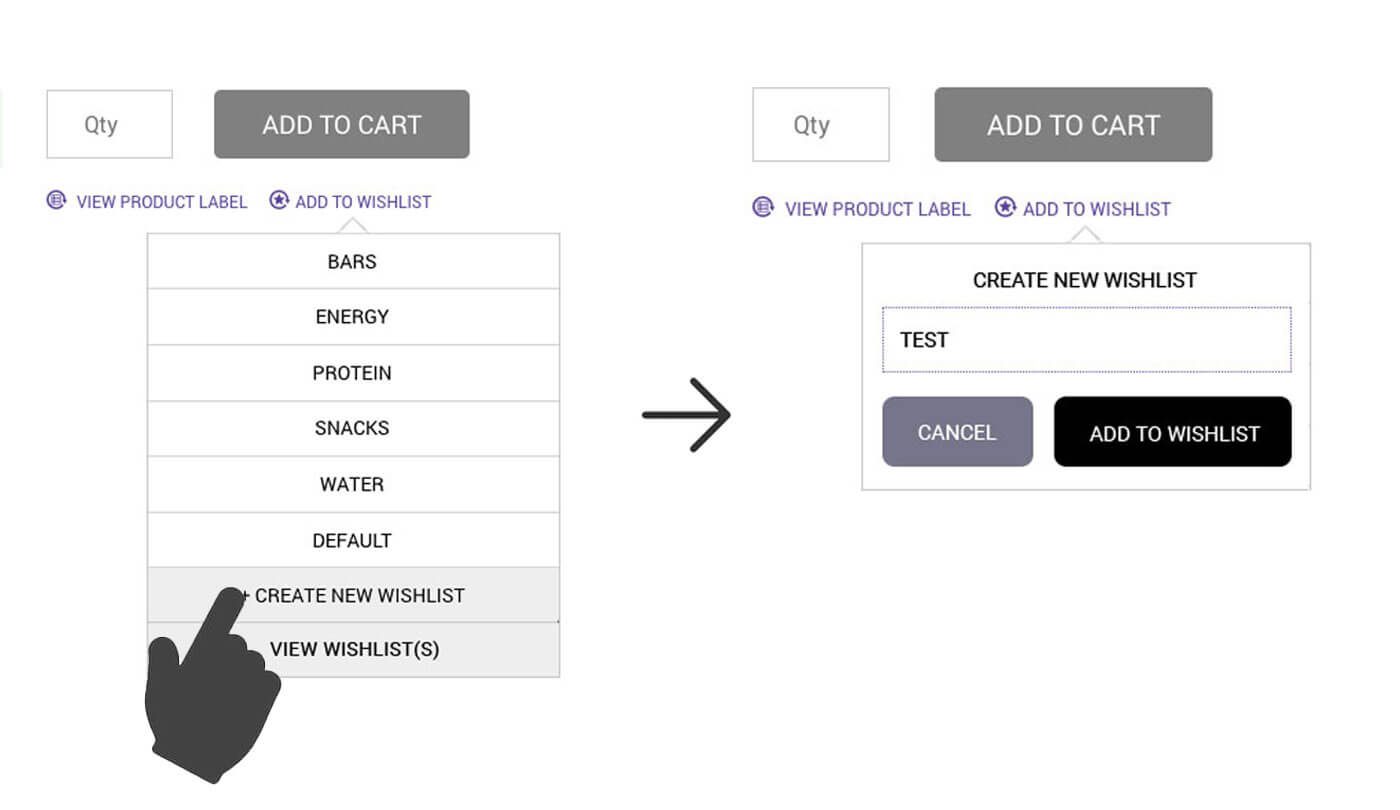
Multiple Wishlists
The old single wishlist system was cumbersome. Customers would spend hours building a list, submit it, then realize they forgot something and have to start over. We gave customers the ability to create and maintain as many wishlists as they wanted, organizing products however made sense for their business: future orders, product categories, seasonal items, whatever worked for them.
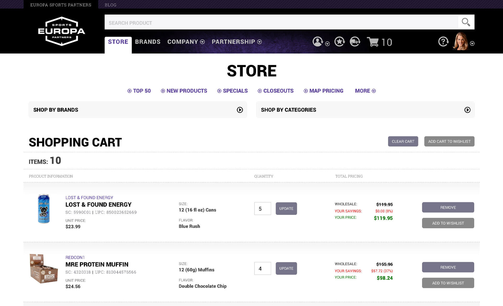
True Shopping Cart
We implemented a standard e-commerce cart where customers could immediately place orders rather than dealing with the confusing wishlist-based system. This alone improved the ordering experience.
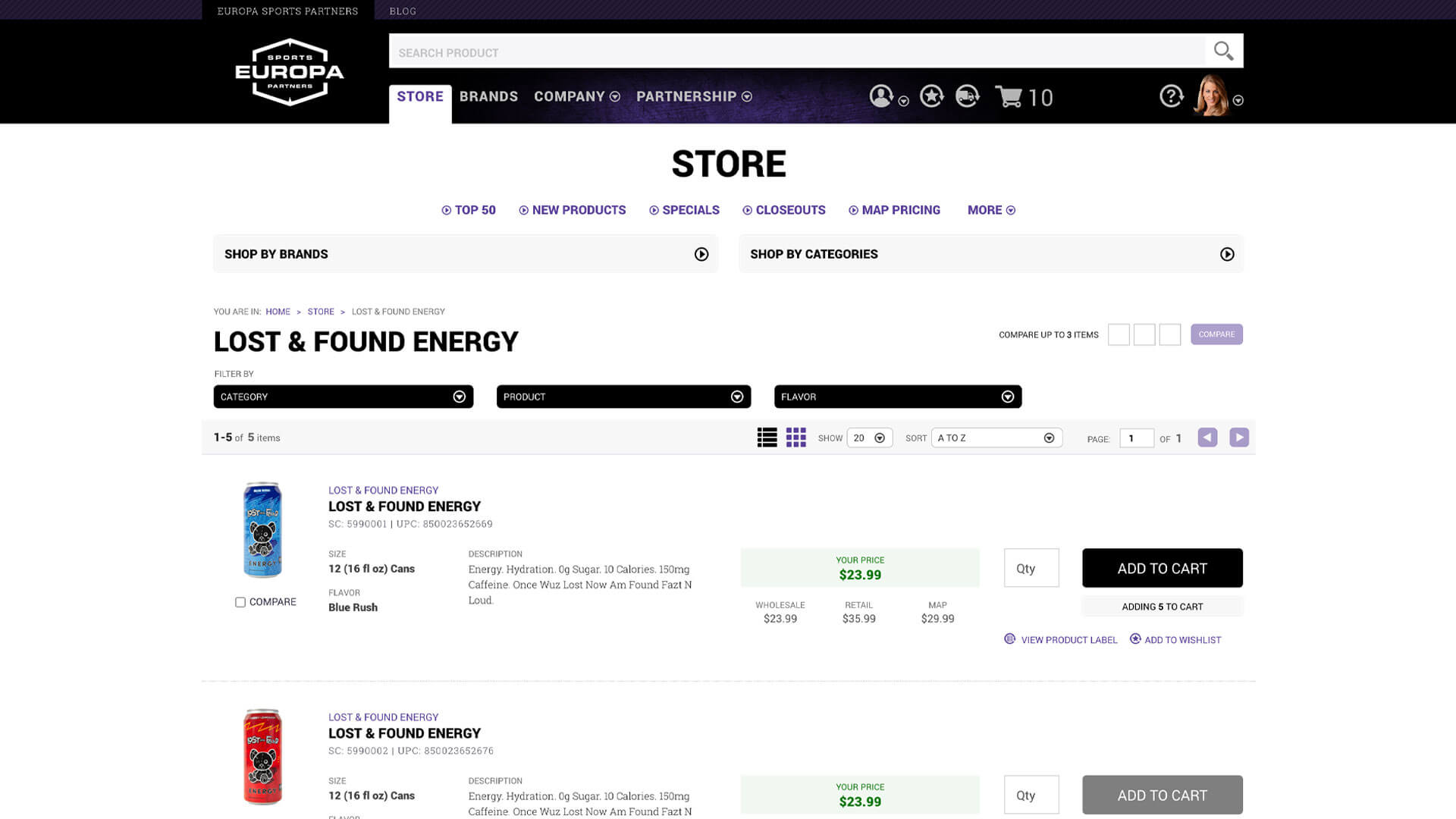
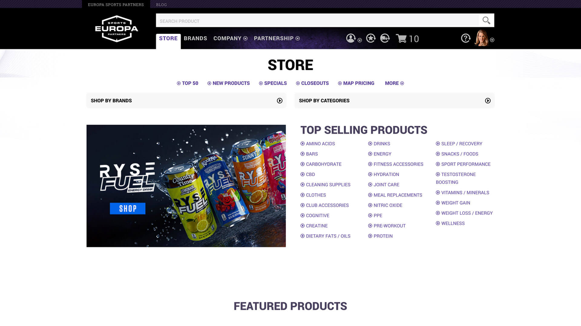
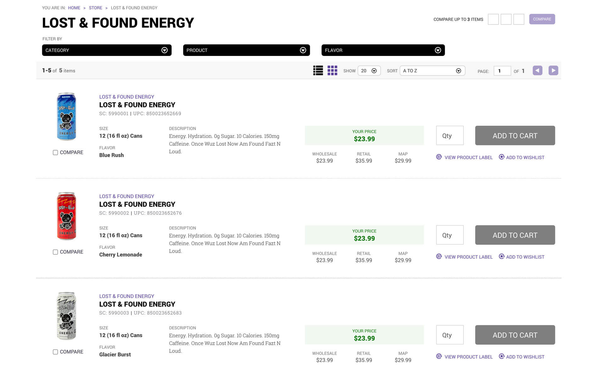
E-Commerce Store Features
The store became the heart of the new experience:
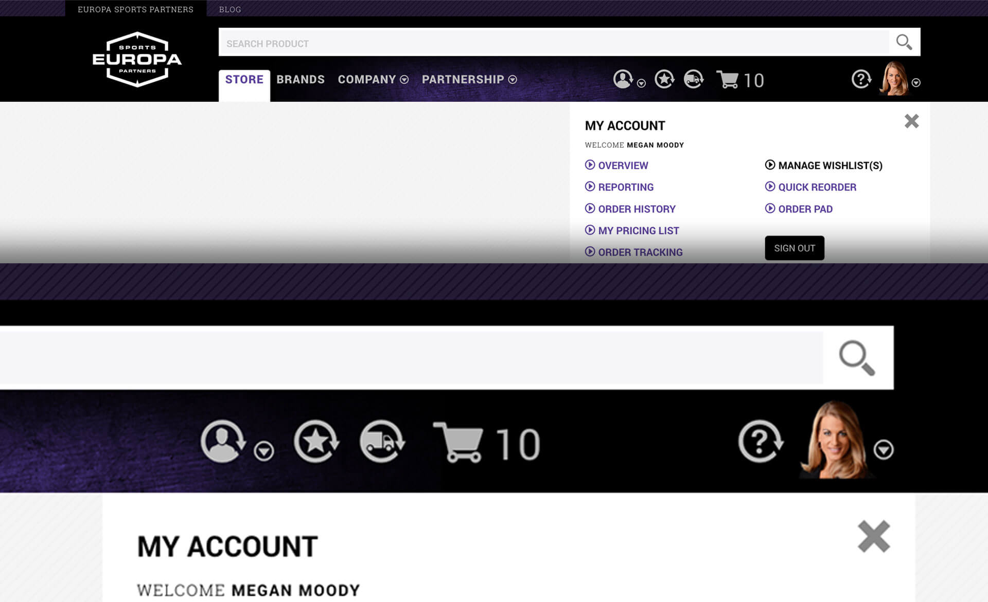
Smart Header
Personalized welcome message when customers signed in. Easy access to account information, wishlists, order tracking, and visual representation of cart contents. Everything a customer might need was immediately accessible.
Always-Available Links
Store links like Top 50, Specials, New Products, Closeouts, MAP Pricing, Discontinued items, and Vendor Price Changes were always accessible within the store experience. Customers could jump to any of these from anywhere in their shopping journey.
Search and Discovery
The intelligent search system showing suggestions in real time as customers typed. We also provided "Shop by Brand" and "Shop by Category" filters for customers who preferred browsing to searching.
Store Landing Experience
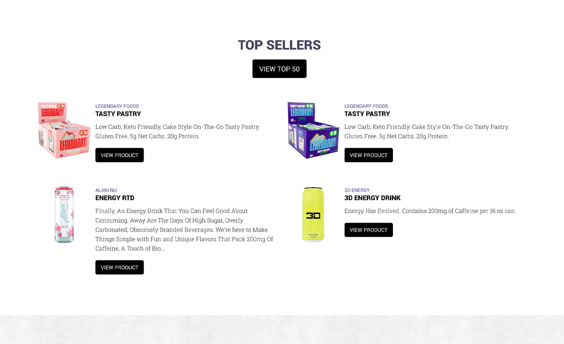
Vendor-sponsored banner carousels, links to top-selling products within categories, featured product carousels, current specials with links to view all, most current new products. The landing page dynamically updated to show total brands offered and total products available, reinforcing Europa's product catalog.
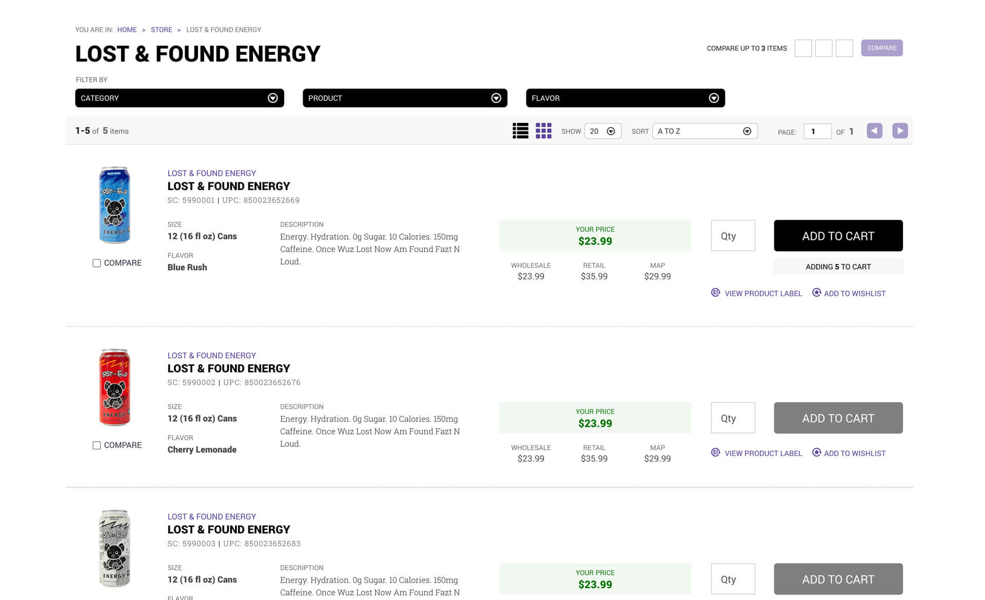
Product Listings
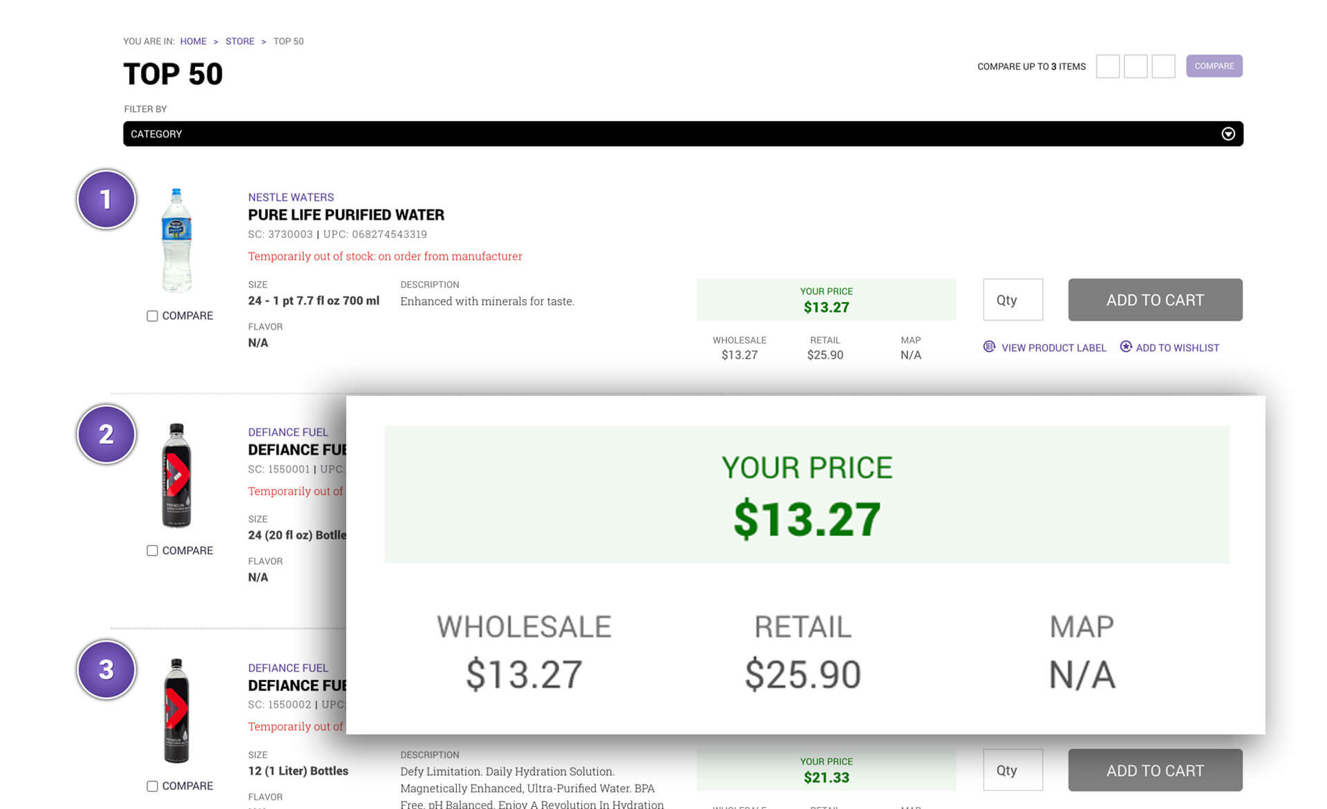
Customers could narrow results with filters, compare three products side-by-side, switch between grid and list views, sort by relevance, alphabetically, newest, or top-selling, choose viewing preferences, and paginate through results. Each product showed key information with quick access to add to cart, add to wishlist, or view product labels. Recently viewed items stayed accessible.
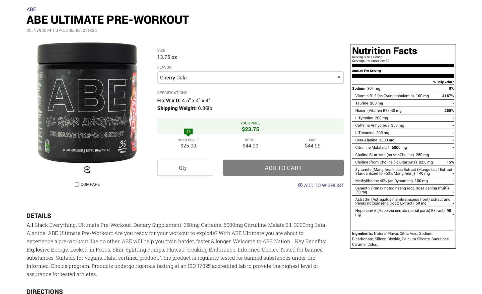
Product Detail Pages
Comprehensive product information including details, directions, warnings, nutrition facts, and ingredients. Quick add to cart and wishlist actions. Recommended items based on what other customers bought. Recently viewed items for easy comparison.
Customer Pricing
We showed customers their savings by comparing it to wholesale, retail and MAP (Minimum Advertised Price) pricing.
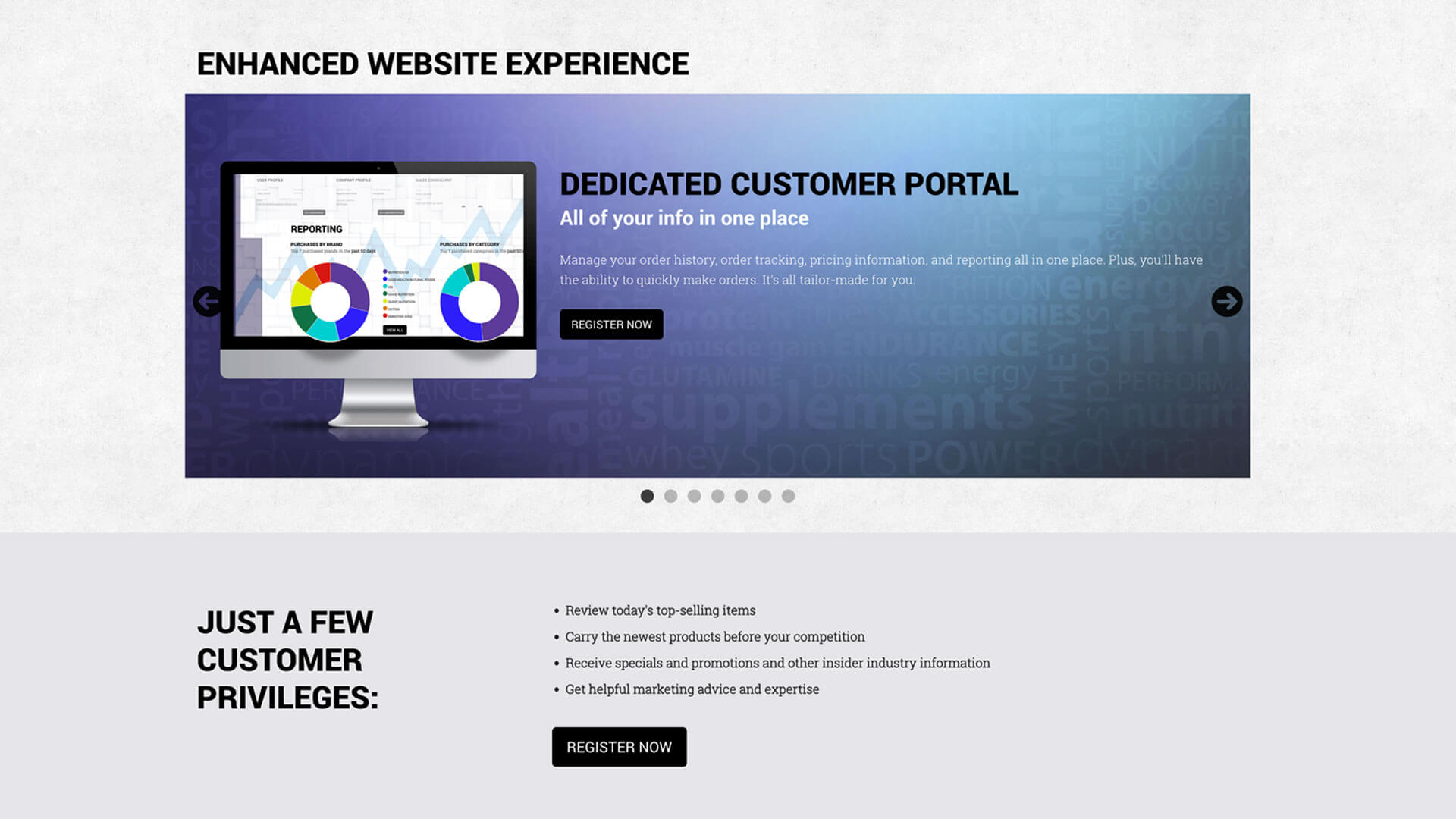
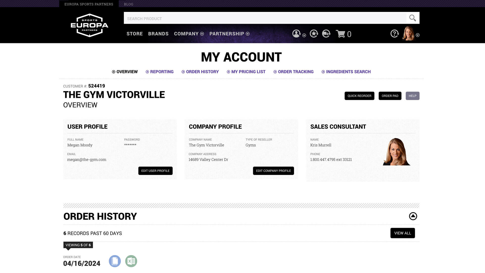
Customer Portal Features
The customer portal gave customers a single location to manage everything related to their relationship with Europa:
Dashboard
Pertinent information at a glance. Order history, order tracking, account status, quick actions. Everything a customer needed to see regularly was right there.
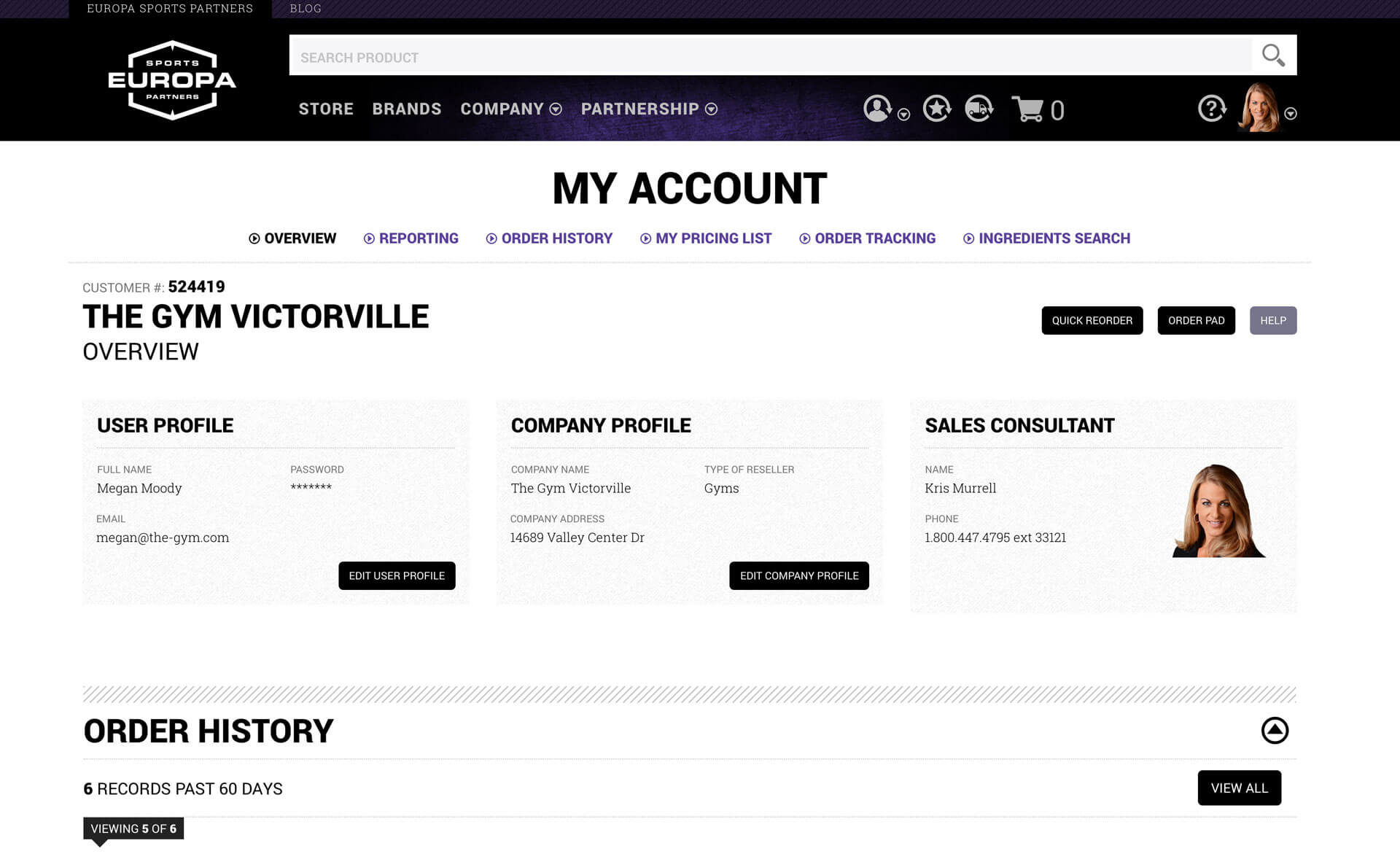
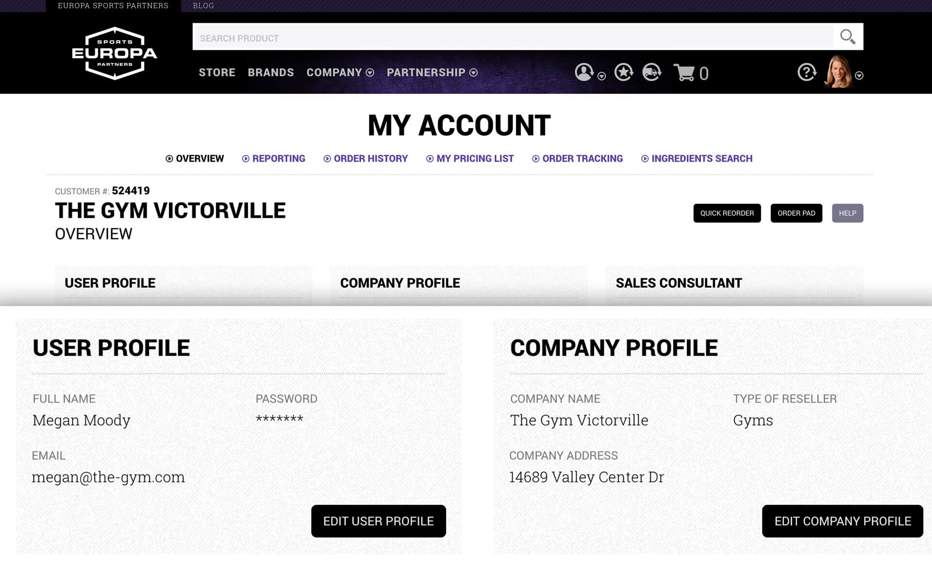
Profile Management
Update user profile information, easy access to sales rep contact details.
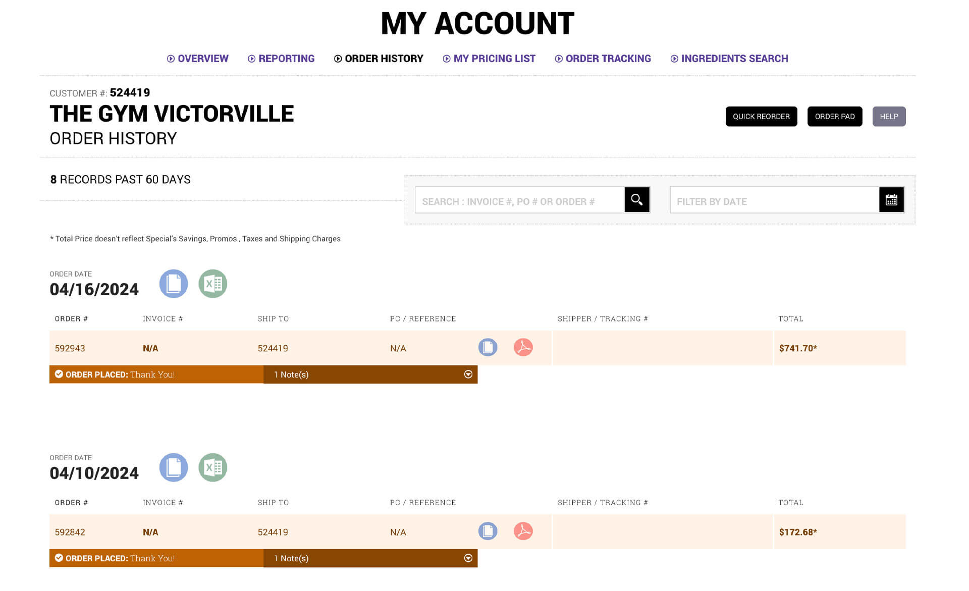
Order Management
Complete order history with search and filtering. Real-time order tracking. Statement of account access.
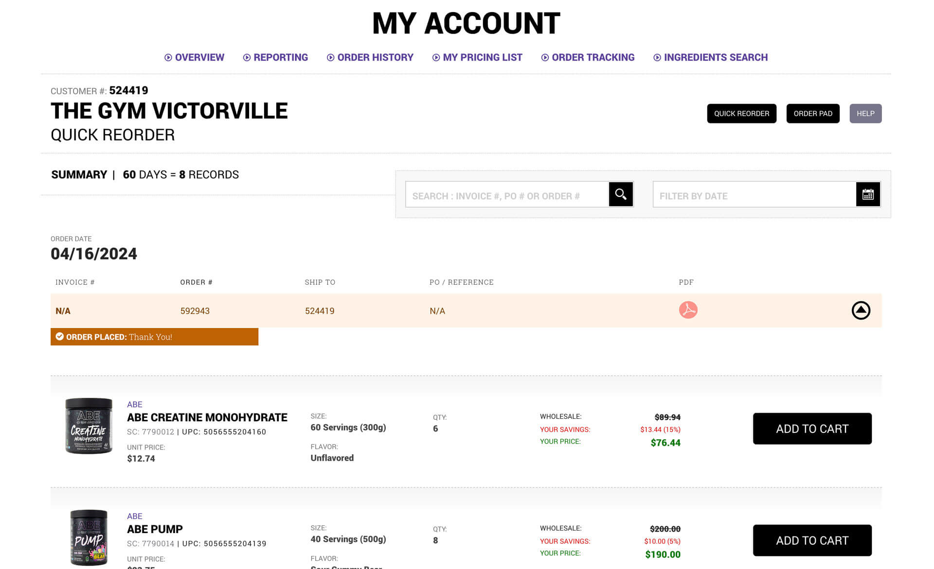
Quick Reorder
Ability to reorder complete past orders or individual items from those orders. This became one of the most-used features because it saved customers a lot of time.
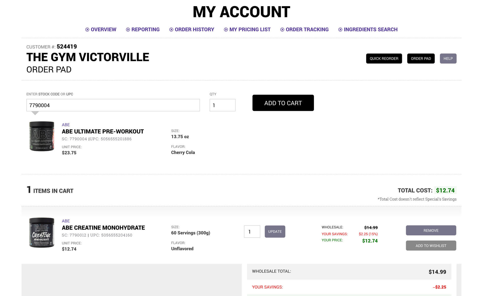
Order Pad
Customers could easily build carts using just stock code numbers. This catered to experienced customers who knew exactly what they wanted and didn't need to browse or search. Paste in a list of stock codes and quantities, and the cart populated automatically.
Implement
Technical Implementation
Front-End Development
I worked closely with the development team to align on architecture for the AngularJS framework. My team's responsibility was building the website with HTML and CSS. We reviewed mocks and broke down UI elements into components and main sections like header, footer, and content areas.
I chose Foundation for Apps as our CSS framework, providing a responsive grid system that was flexible and customizable. We used BEM (Block Element Modifier) methodology for CSS naming so we could reuse components anywhere in the application.
Single-page application
This was my first JavaScript framework single-page application project, and it fundamentally changed how I thought about designing and building large-scale products. The architecture allowed for smooth transitions between sections, faster load times after initial page load, and a more app-like experience that felt modern and responsive.
Agile Process
We used Atlassian Jira for our Scrum agile framework, running two-week sprints with retrospectives at the end. I planned all tasks for the design team and we followed a strict timeline. The agile approach meant we could iterate quickly based on feedback and adjust priorities as business needs evolved.
Evaluate
Testing & Feedback
The Product Filtering Revelation
We designed the e-commerce system with extensive filtering mechanisms that the team and I thought were easy to use. After usability testing and feedback from the sales team, we discovered our target audience wasn't as computer literate as we'd assumed. You know what they say about assuming.
I simplified the filtering system as much as possible. This one insight completely rethought my approach to the entire redesign. My mantra became "remove complexity, keep it simple." This revelation helped me understand the target audience and how to help them navigate the site more effectively.
Product Listing Evolution
Initially, we designed product listing pages showing one product that represented multiple flavors. Customers had to click into product details to see all flavor options and add them to cart. After usability testing, we realized customers wanted all products visible in the listing pages so they could add items to cart without extra navigation. We adjusted the design based on this feedback.
Post-Launch Refinements
After release, we received many compliments, but more importantly, we received productive feedback. Three significant refinements came directly from customer input:
Refinement 1:
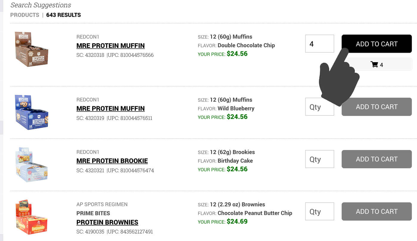
Add to Cart from Search Results
Customers wanted the ability to add products to cart directly from search results without going to product pages. We added this functionality.
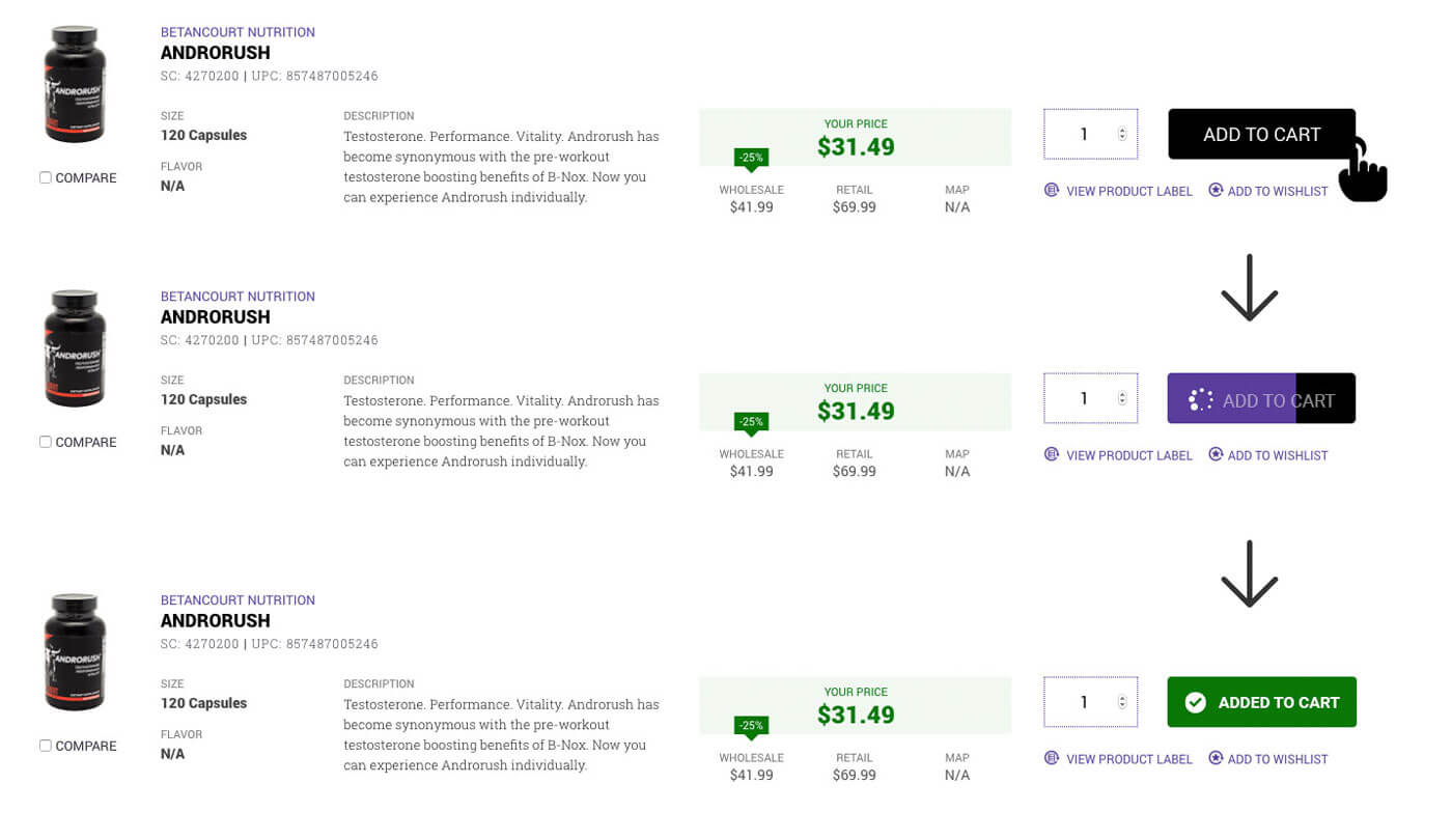
Refinement 2:
Quick Add to Cart Animation
The popup modal we used each time someone added a product to cart slowed them down. I designed a quick-action button with animation showing the product was automatically added, eliminating the interruption.
Refinement 3:
Streamlined Wishlist Action
Similar to the cart issue, customers found the wishlist popup modal slow. We changed it to a tooltip component allowing in-page action without disrupting flow.
Results and Impact
Business Metrics
The redesign delivered measurable business value immediately and sustained it over 10 years:
- 45% increase in online orders after launch
- Customer retention rate: 60% of customers continued ordering year-over-year
- Conversion rate improvement: customers placing orders online doubled compared to the old website.
- Feature adoption: 35% of customers used quick reorder feature regularly
- Sales team efficiency gains: reps spent less time on phone calls with customers answering basic questions and more time building relationships and closing deals.
User Satisfaction
The sales team reported that customers were happier with the experience and could accomplish more tasks independently. The intuitive design reduced friction and made ordering feel effortless compared to the old system.
Long-Term Success
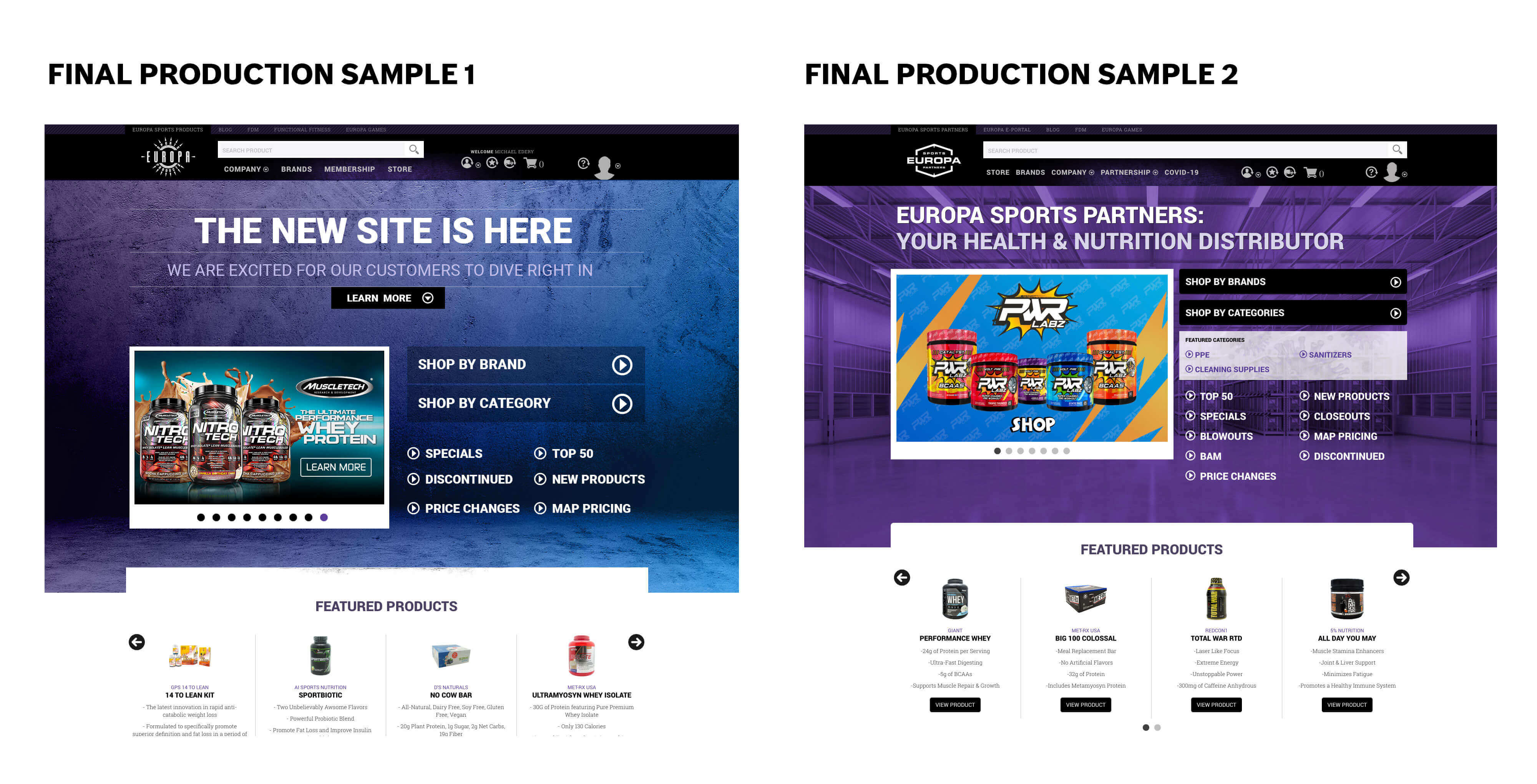
The platform launched in 2015 and served Europa Sports successfully for 10 years until the company's closure in 2025. Over that decade, we continued adding features and building out additional portals (CMS, Vendor Portal, Franchise Portal, Employee Portal), but the core e-commerce and customer portal experience I designed remained the foundation.
Personal Growth
This project was my biggest professional win. I gained full understanding of a complex business model and the processes needed to help run it efficiently. Technologically, working on my first JavaScript framework single-page application forced me to rethink the entire design process for large-scale projects.
The team grew closer and worked together faster as we moved forward. But the biggest win was releasing a product that increased revenue for the company and helped customers maneuver through their work with ease. We made the redesign intuitive, feature-rich, and scalable.
Key Takeaways
Know Your Audience Deeply
Assumptions will kill good design. I assumed customers would find our filtering systems easy because they seemed logical to me. Usability testing revealed our target audience had different computer literacy levels than I'd assumed. Simplifying based on real user feedback made all the difference.
Remove Complexity, Keep It Simple
This became my mantra after the filtering revelation. When designing for business users who are busy running their companies, simplicity isn't dumbing things down. It's respecting their time and cognitive load.
Listen After Launch
The best improvements came from customer feedback after release. Being open to iteration and staying connected to how people actually used the platform made it better over time.
Technical Skills Expand Design Possibilities
Learning to work within a single-page application architecture while leading front-end development gave me deeper understanding of what was possible and what constraints existed. This made me a better designer because I could push boundaries while staying grounded in reality.
Collaboration Over Silos
Working closely with developers, stakeholders, and users throughout the process created better outcomes than designing in isolation. The team dynamic we built over that first year carried through the entire 10-year life of the platform.
Conclusion
The Europa Sports enterprise redesign was the most complex and impactful project of my career. Leading the transformation from an outdated B2B ordering system to a modern e-commerce platform required deep business understanding, collaborative design process, technical execution, and continuous iteration based on real user needs.
The 45% increase in online orders and sustained growth over 10 years proved the redesign delivered genuine business value. More importantly, it made customers' work easier and allowed Europa's team to focus on relationships rather than troubleshooting website problems.
This project taught me that great design isn't about impressive visuals or clever interactions. It's about understanding the business deeply, listening to users constantly, removing unnecessary complexity, and building something that actually works for real people doing real work.
Videos
Marketing videos that celebrated the now defunct Europasports.com
– The website was decommissioned after Prenectics decided to shutdown Europa Sports. –
-
 Marketing Material
Responsive view of the europa Sports Website Experience
-
 Marketing Material
Quick display of all viewports in action
