Work
The Project that introduced our Territory Managers to a brave new digital world
Overview
The M-Sales App transformed how Europa Sports' Territory Managers conducted business in the field. Built as an Android tablet application, it replaced a decades-old paper-and-pencil ordering process with a modern digital tool that provided real-time access to pricing, inventory, and customer data.
I guided this project from initial stakeholder buy-in through research, design, development, and successful launch. I worked closely with our design and development teams, but most importantly, I collaborated directly with the Territory Managers who would use the tool daily—treating them as true design partners rather than just end users.
My Role
Lead UX/UI Designer
Lead Front-End Developer (HTML / CSS)
Key Results
- 60% increase in Territory Manager sales compared to the paper-and-pencil process
- Significant time savings enabled TMs to visit more customers daily
- Real-time access to pricing, inventory, and customer data at point of sale
- Increased confidence and professionalism during customer interactions
-
 M-Sales Application
This video shows a small portion of the M-Sales App experience.
-
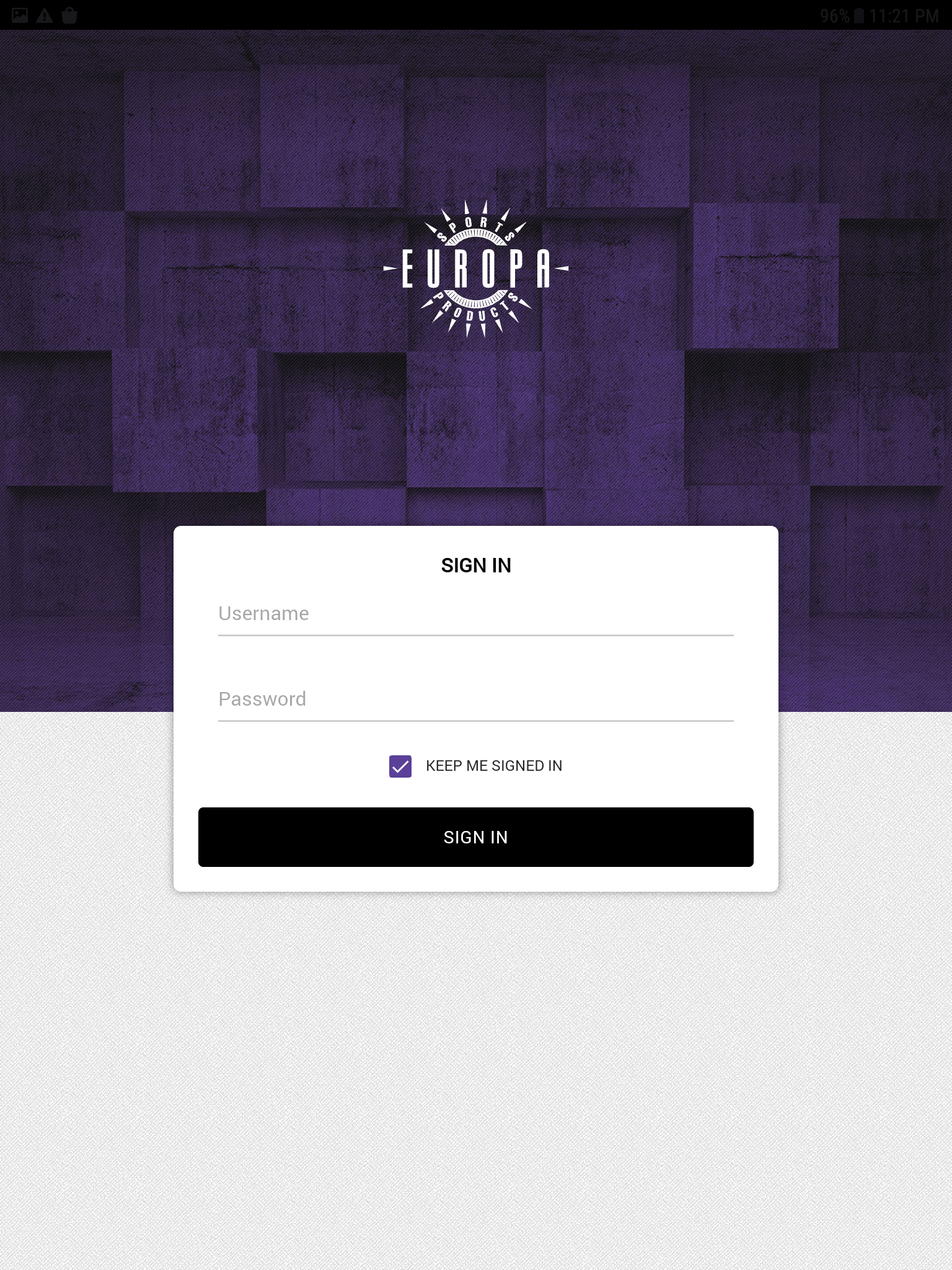 Sign In
Territory Manager's Sign in to access customer information.
-
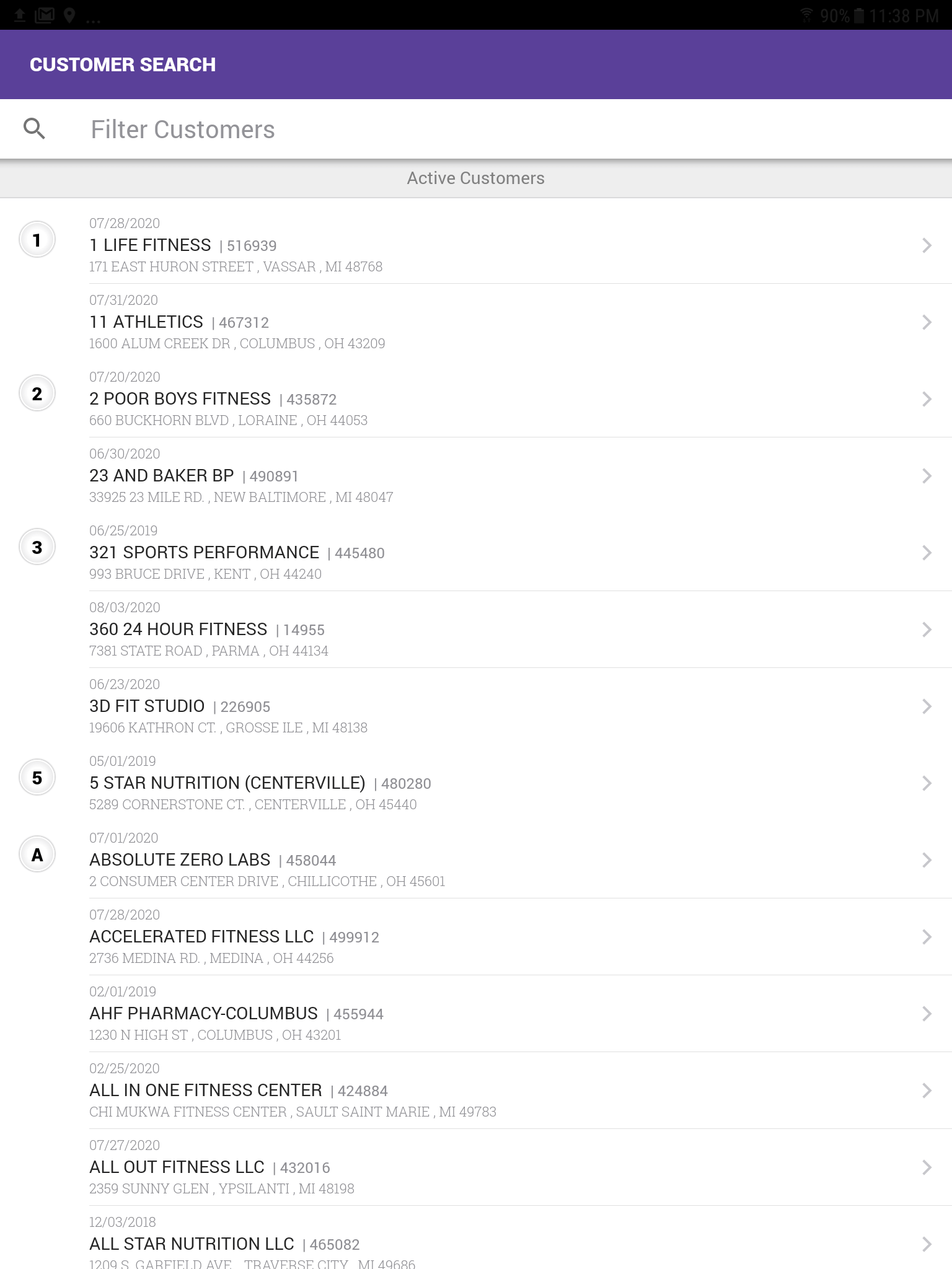 Customer Search
Search for particular customer.
-
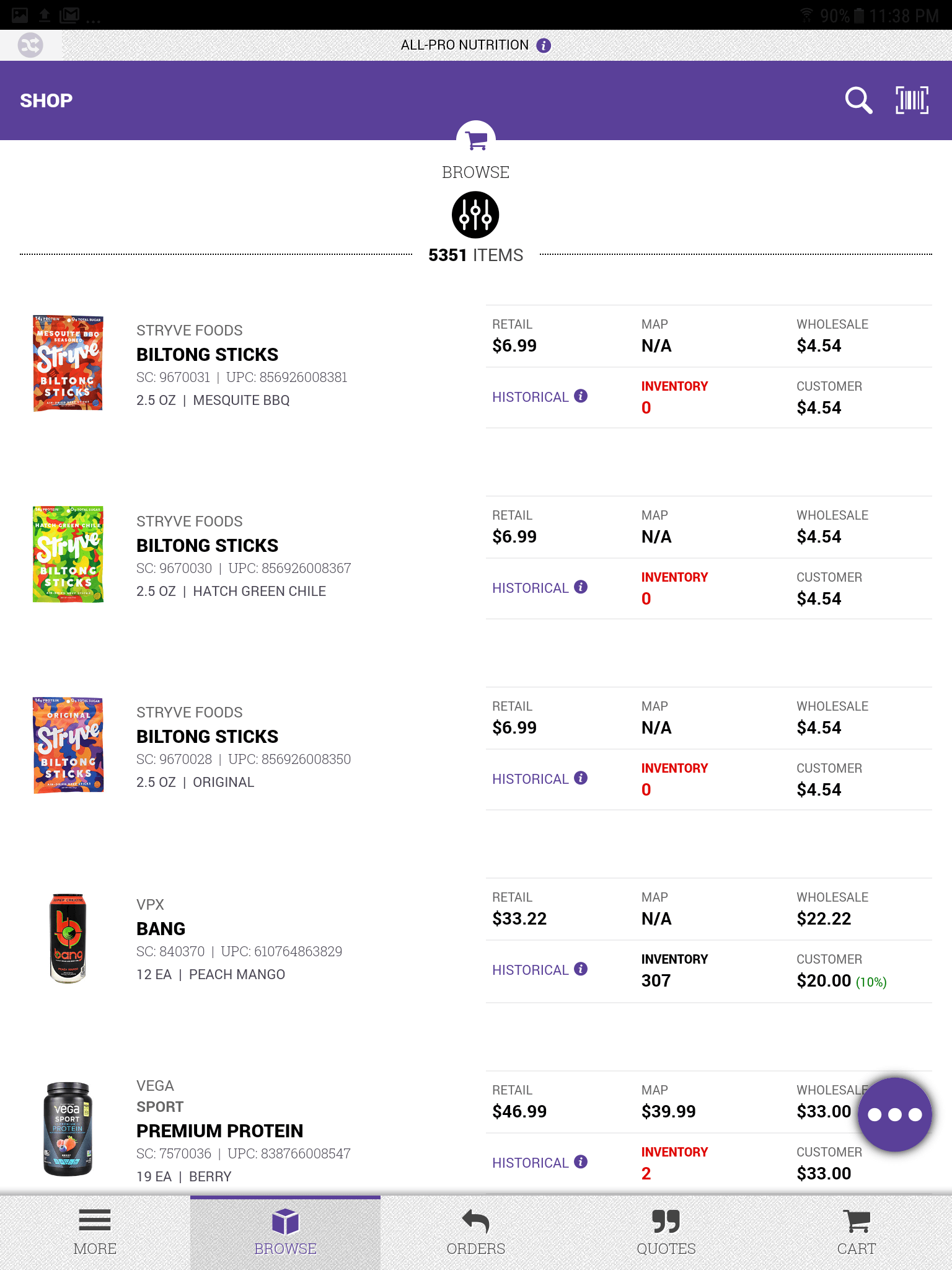
Browse all products
Browse all products landing page.
-
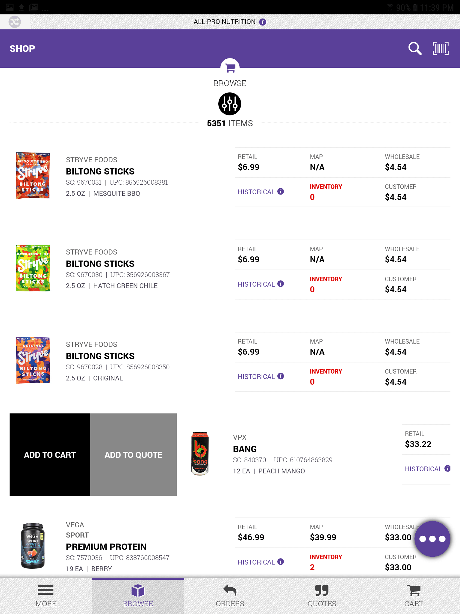 Add to Cart
Swipes right on item to add to cart or add to a quote.
-
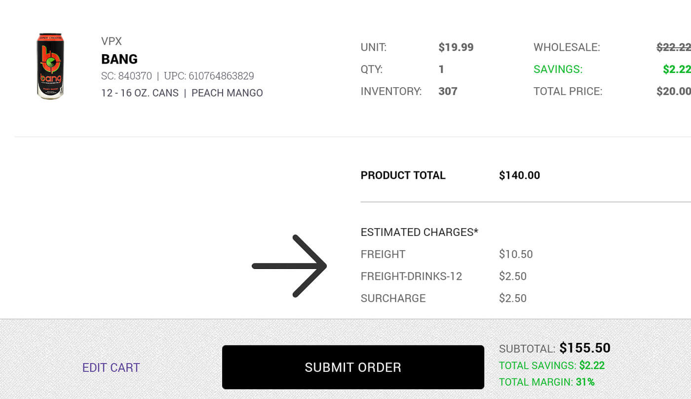
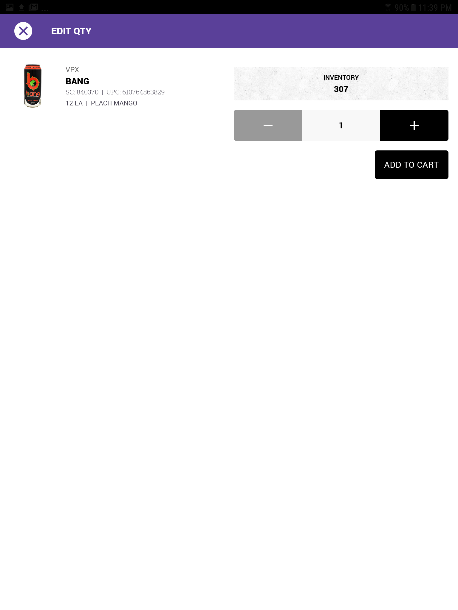 Add to Cart: Edit Quantity
Set desired quantity to be added to cart or quote.
-
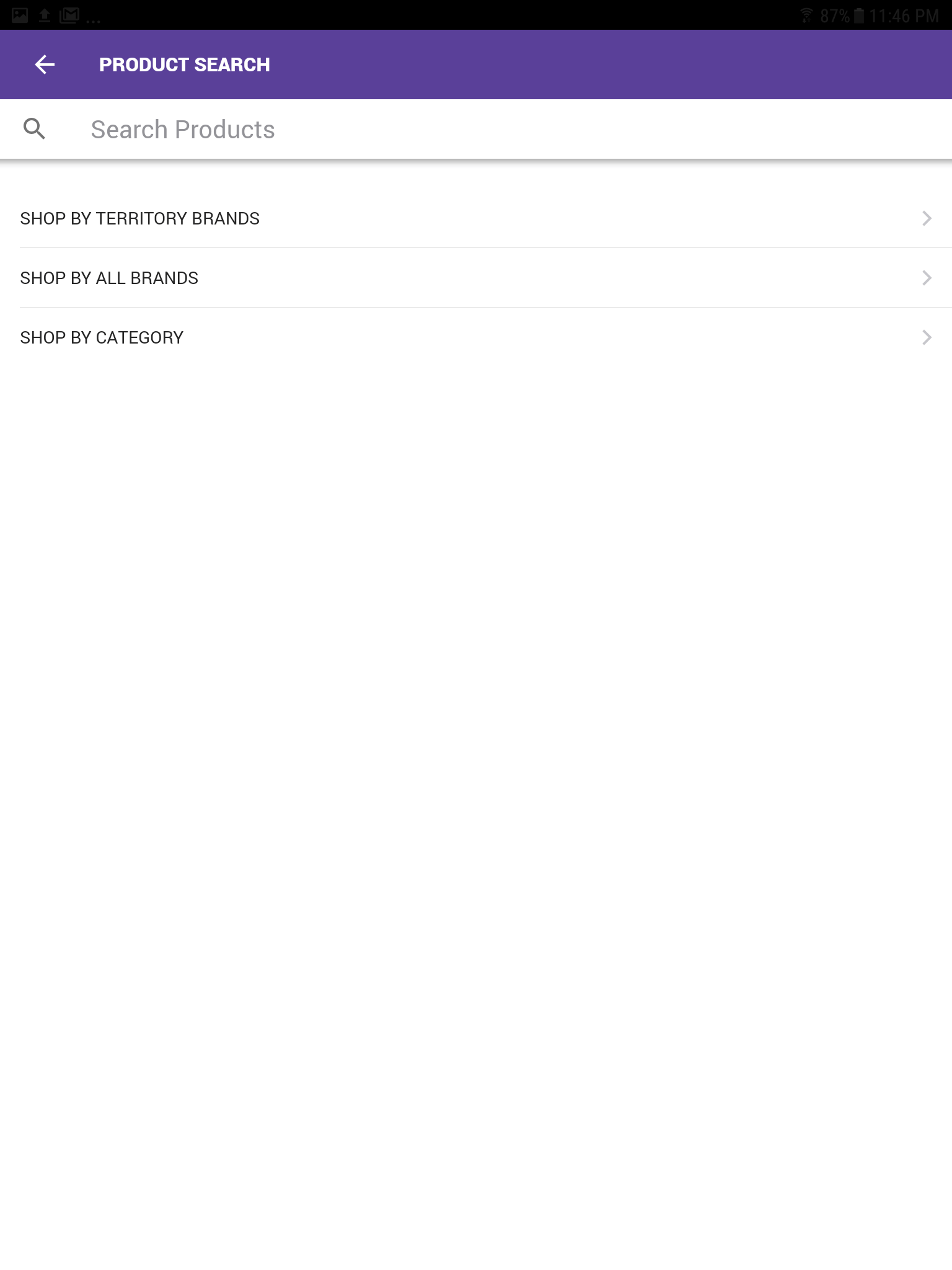 Product Search
Search options
-
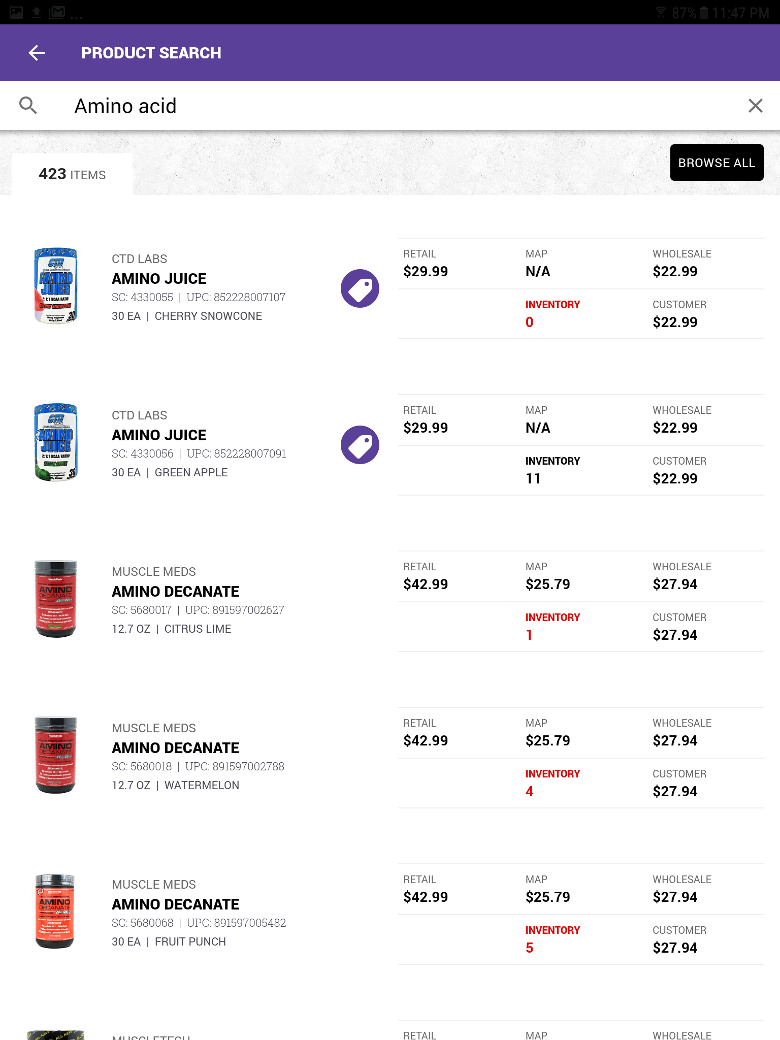 Product Search
Search products for amino acids
-
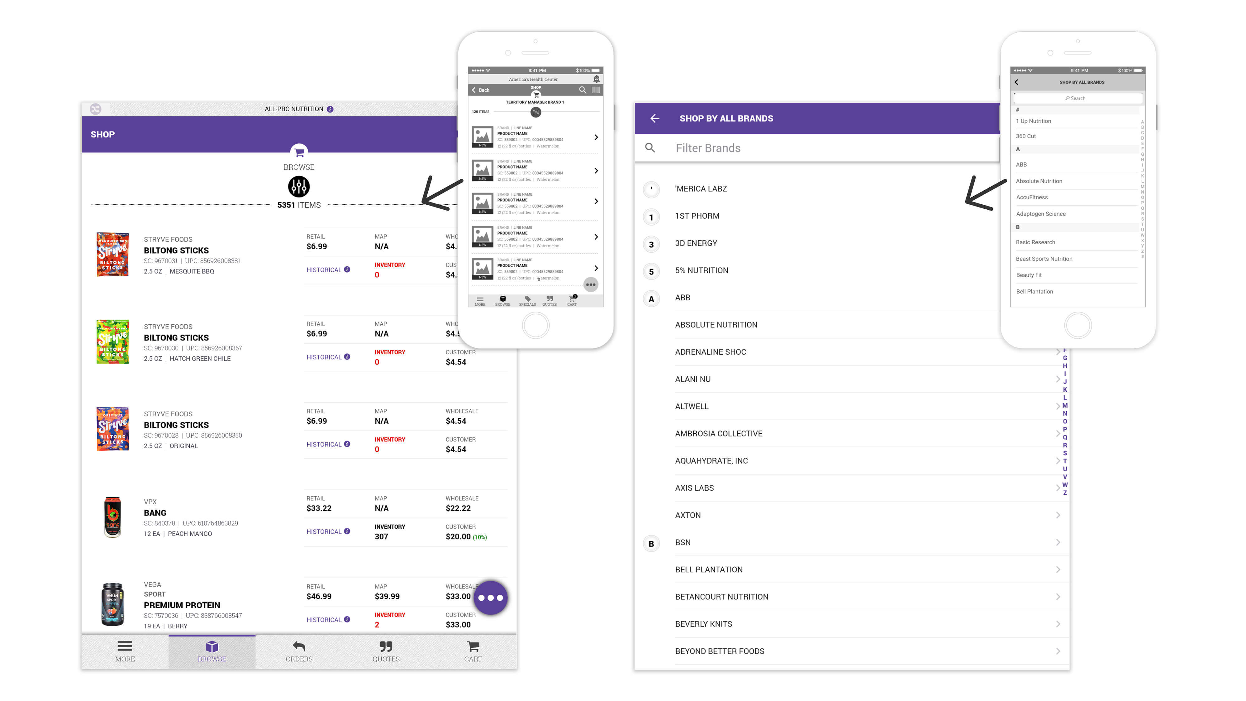
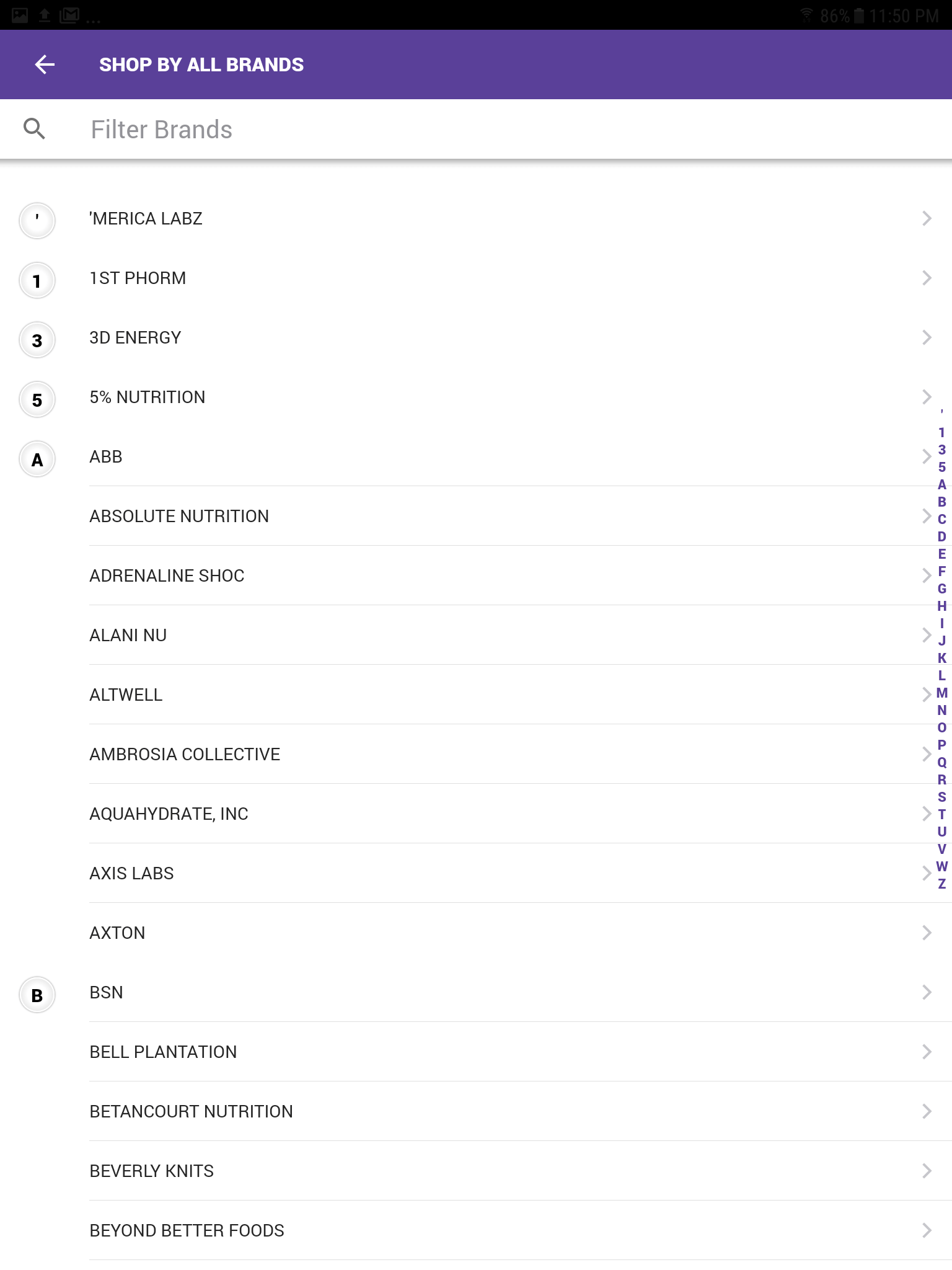 Shop by All Brands
Ability to filter products by specific brand
-
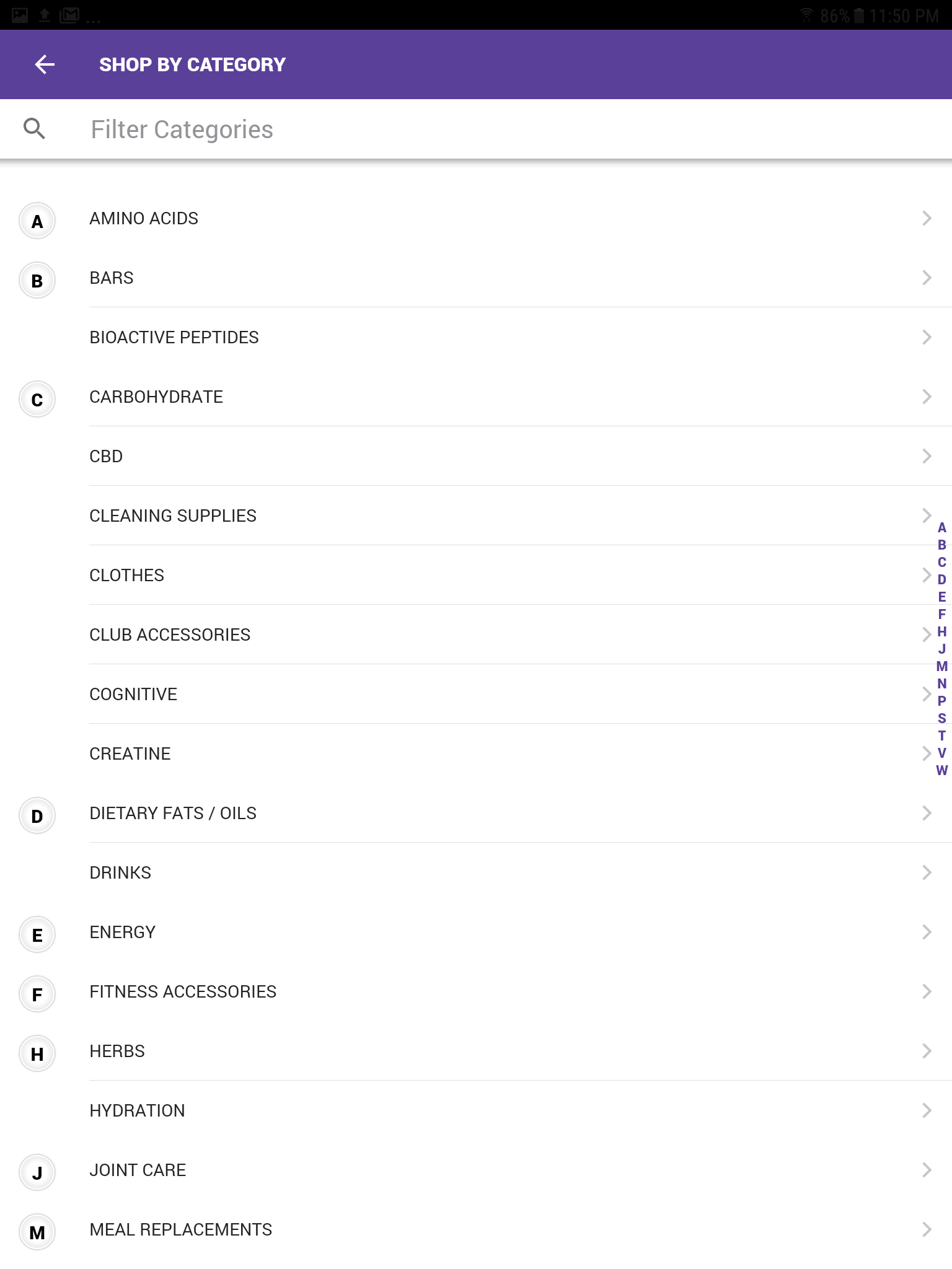 Shop by Categories
Ability to filter products by specific categories
-
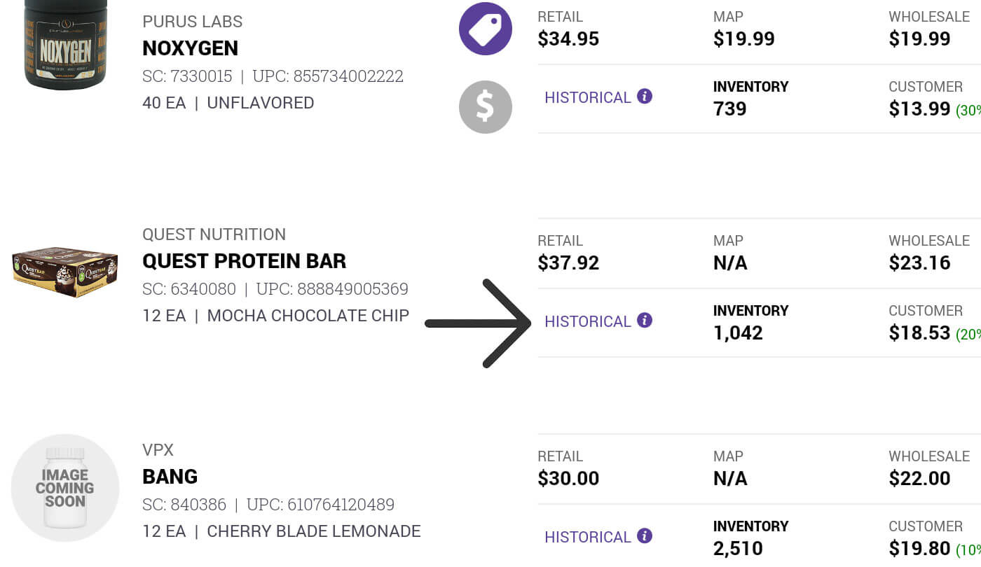
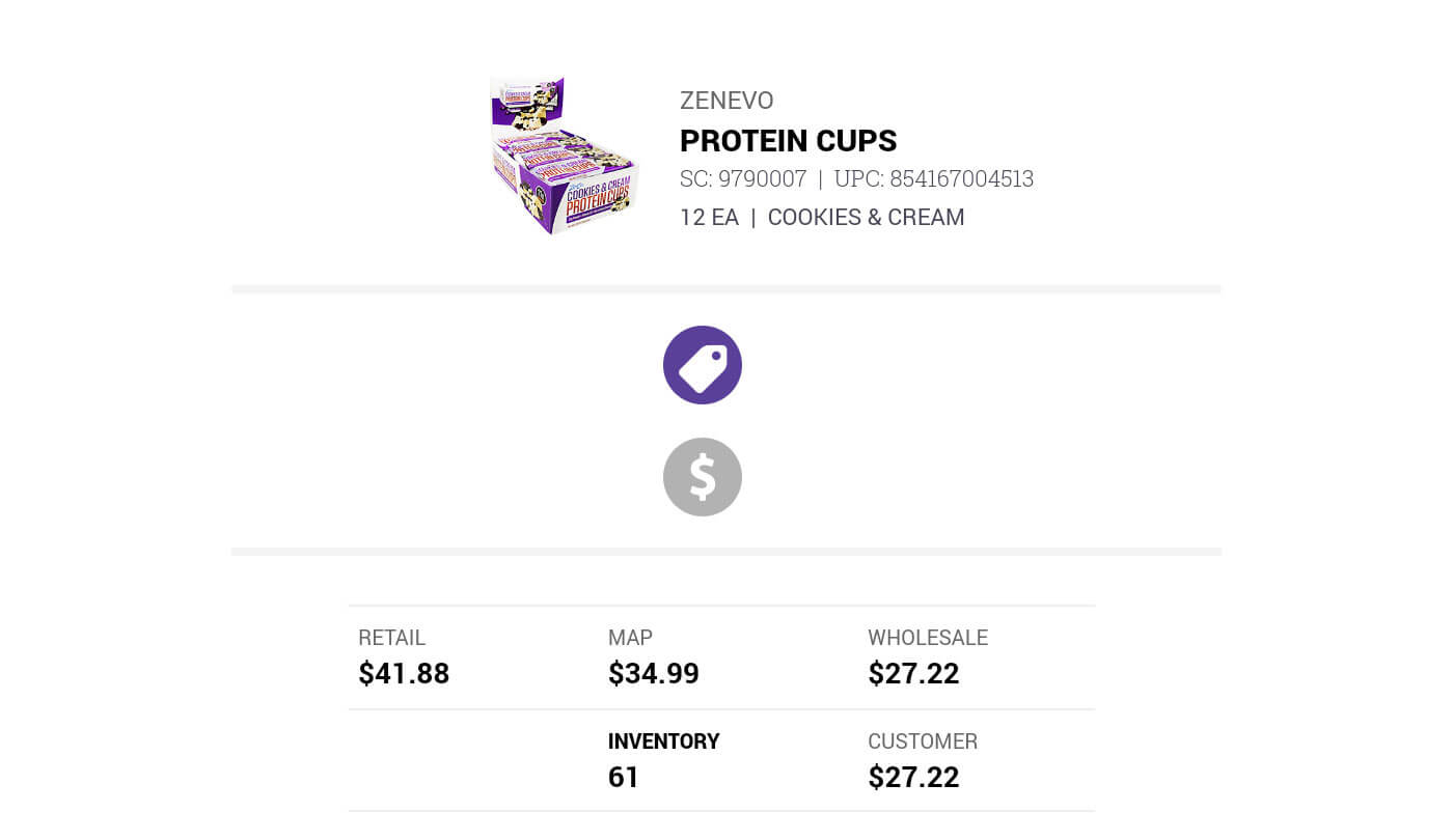
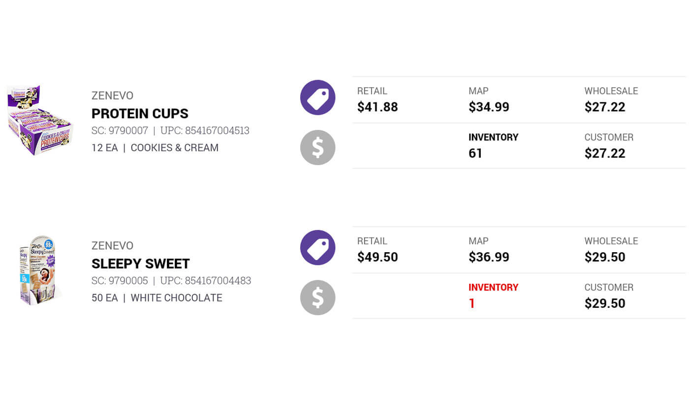
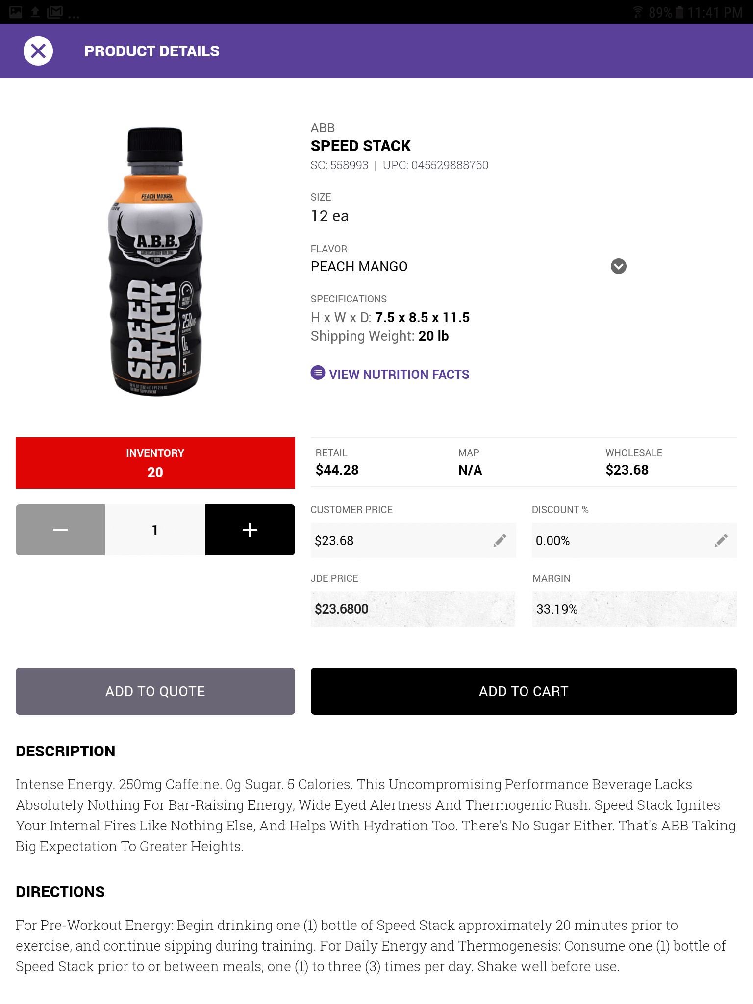 Product Details
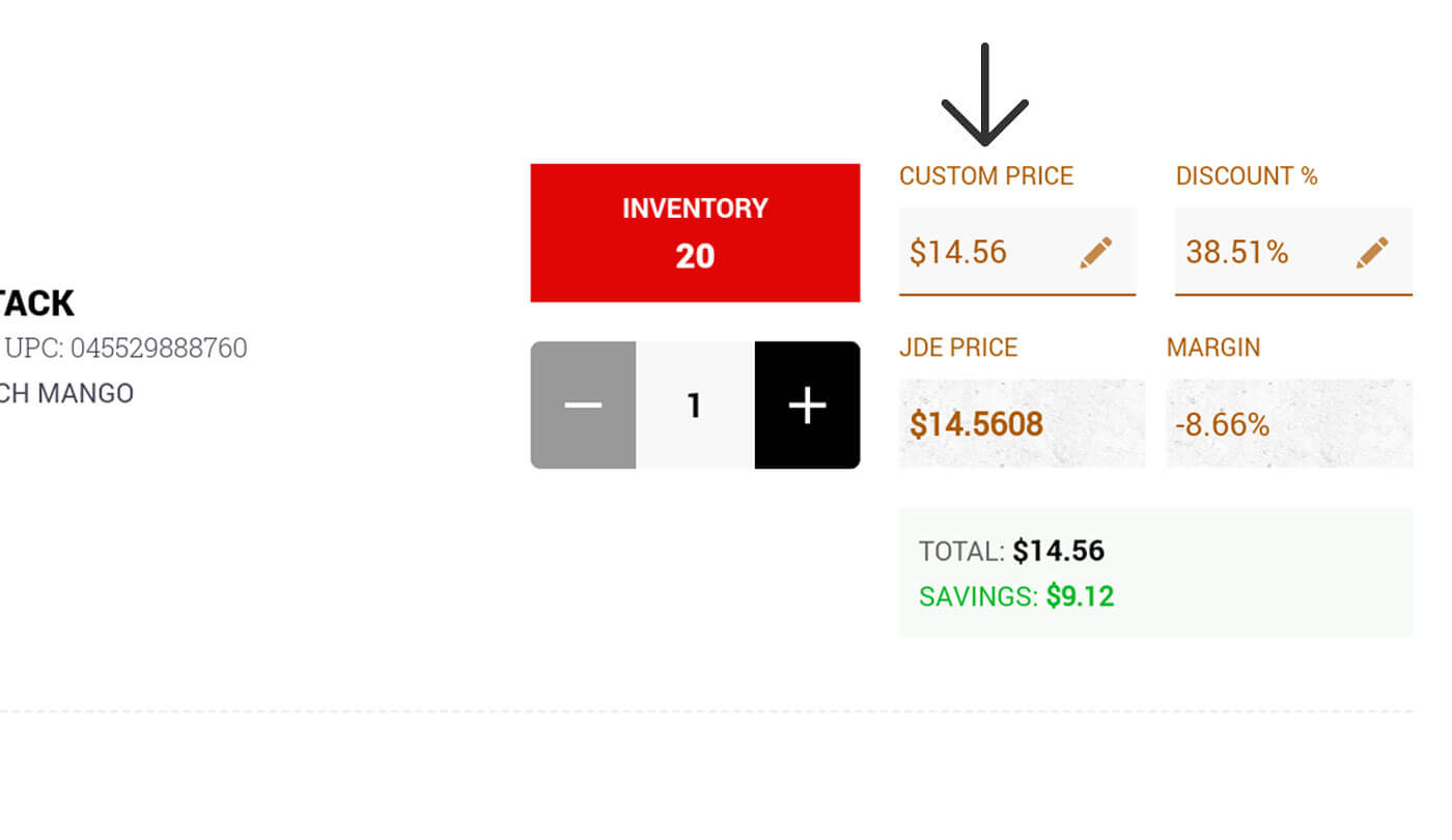
All information about a specific product with ability to adjust price and discount %.
-
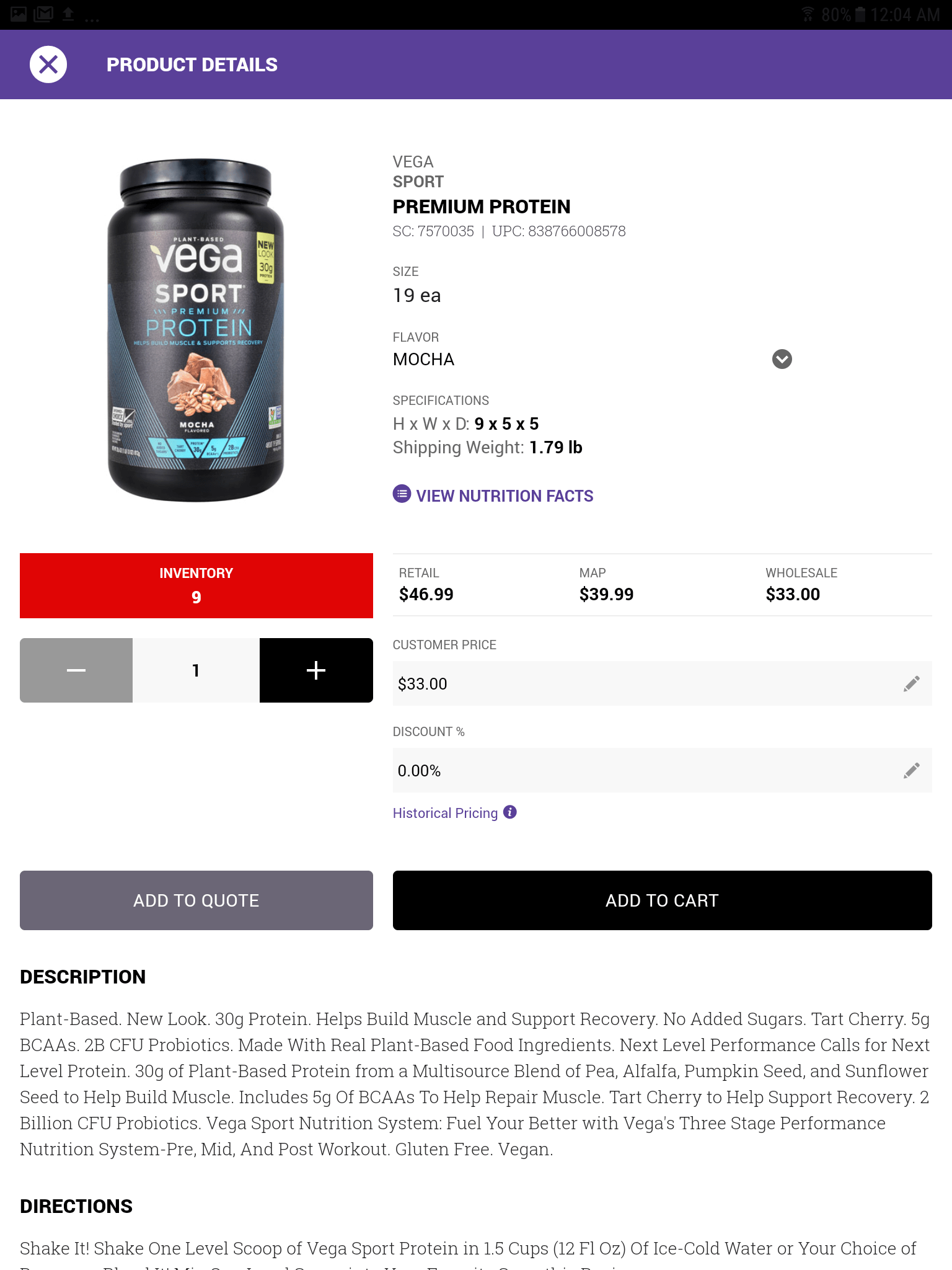 Product Details: Presentation Mode
All information about a specific product minus the ability to adjust price and discount %.
-
Product Details: Presentation Mode
All information about a specific product minus the ability to adjust price and discount %.
-
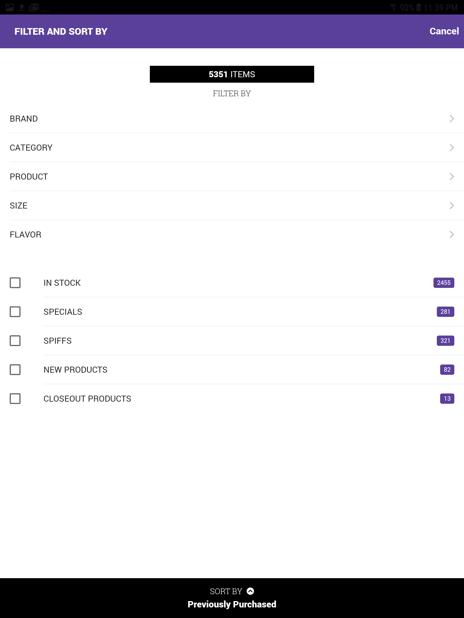 Filter and Sort
All options to filter and sort products.
-
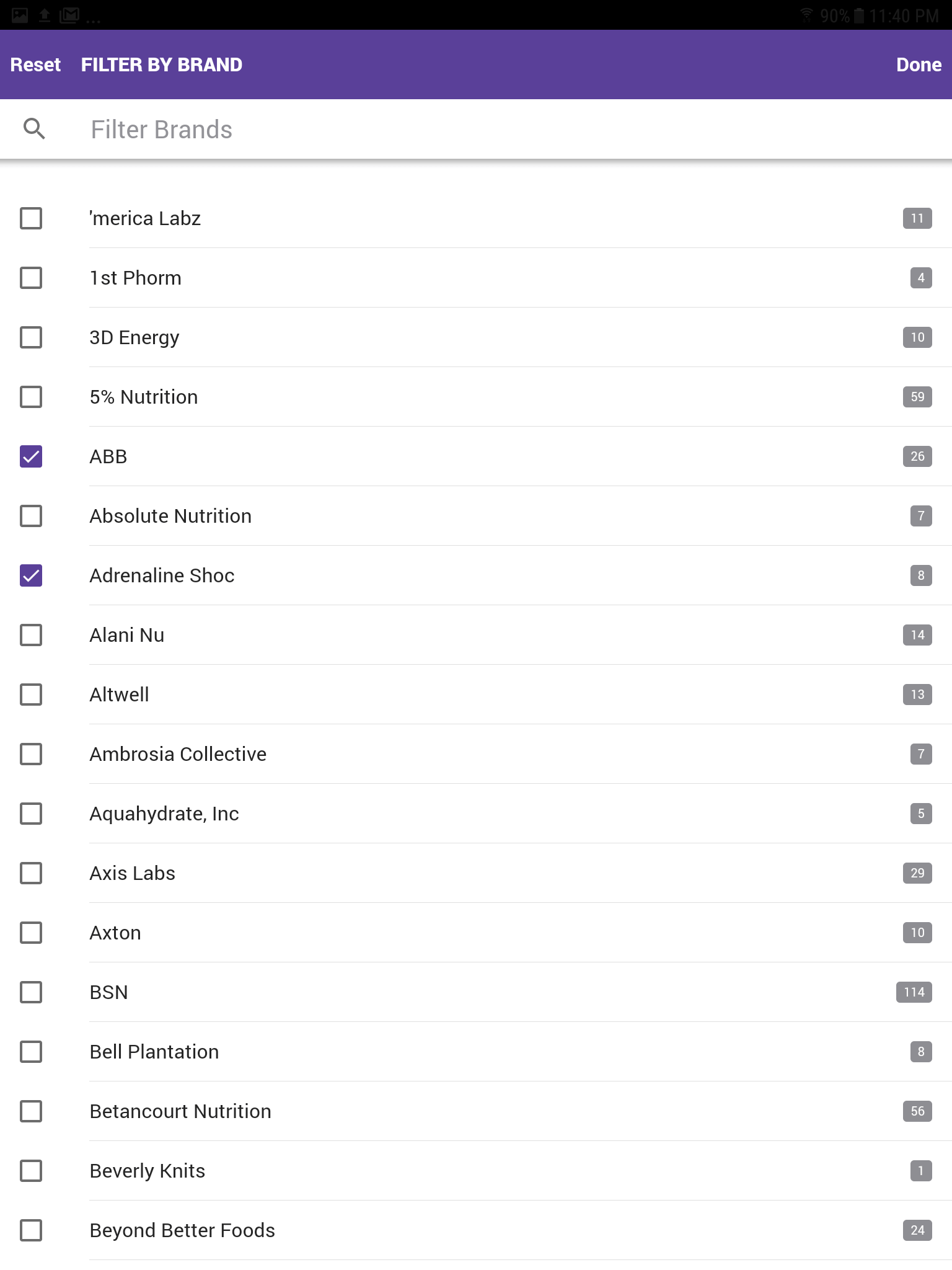 Filter by Brand
Ability to filter product by specific brand. Select ABB and Adrenaline Shoc.
-
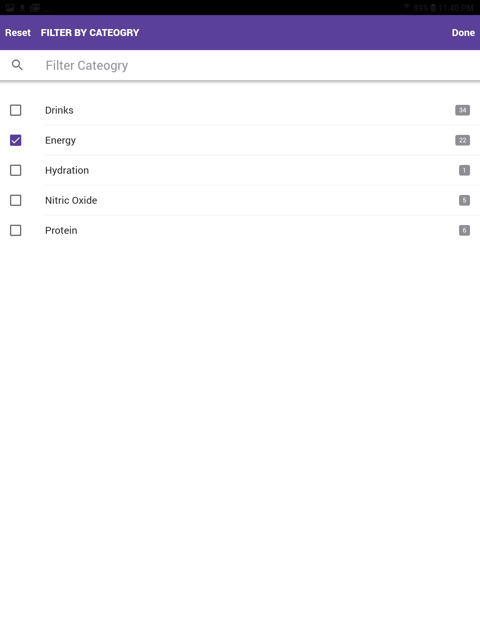 Filter by Category
Ability to filter product by specific category. Select energy.
-
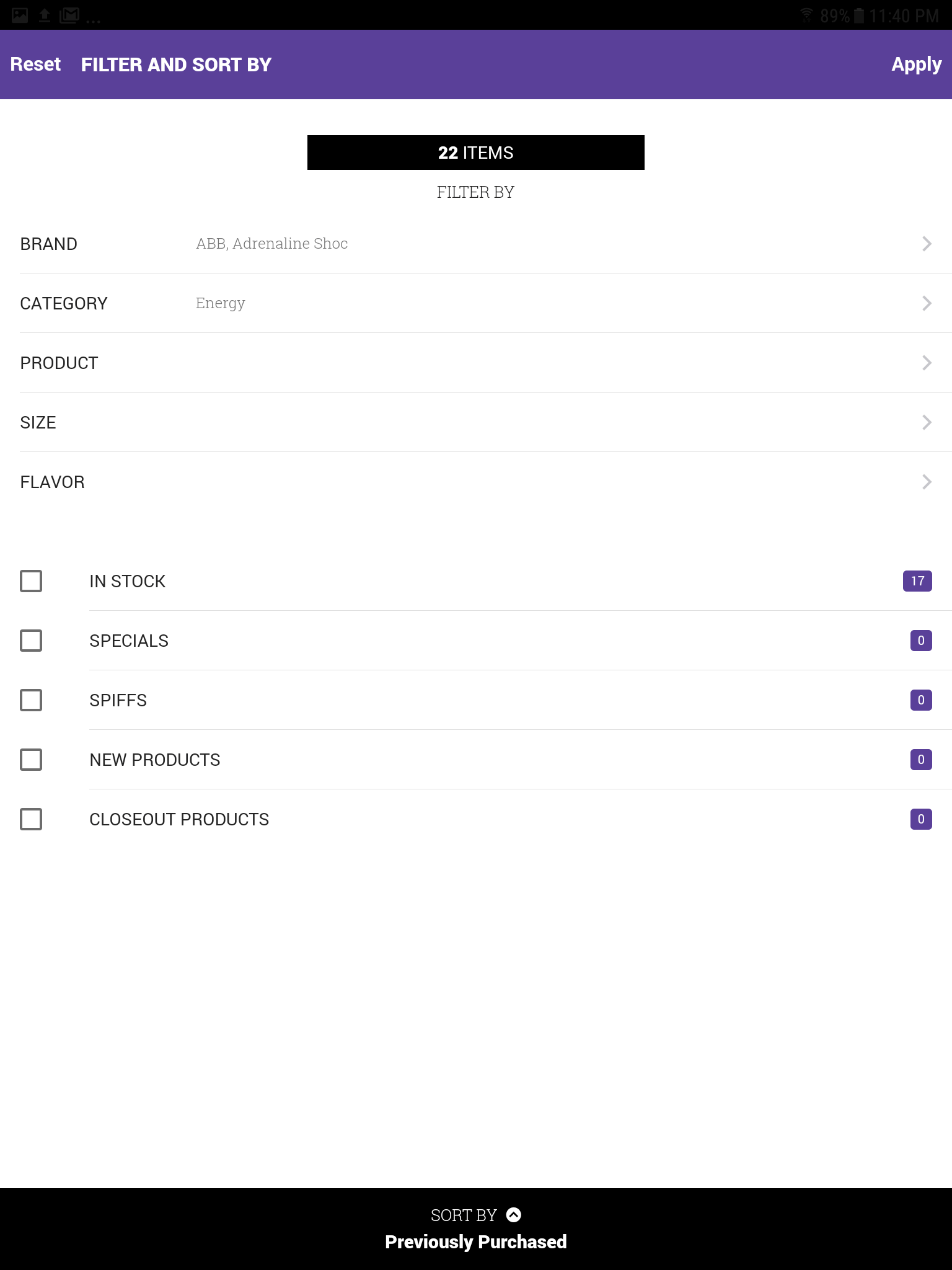 Filter and Sort: Selected Filters
After the brands ABB and Adrenaline & the category energy were selected.
-
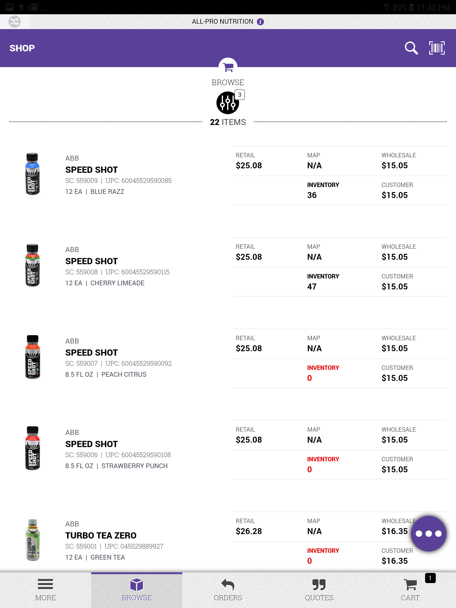 Filter and Sort: Filtered Products
The product listing results after the filter was applied to the ABB , Adrenaline Shoc brand & energy category.
-
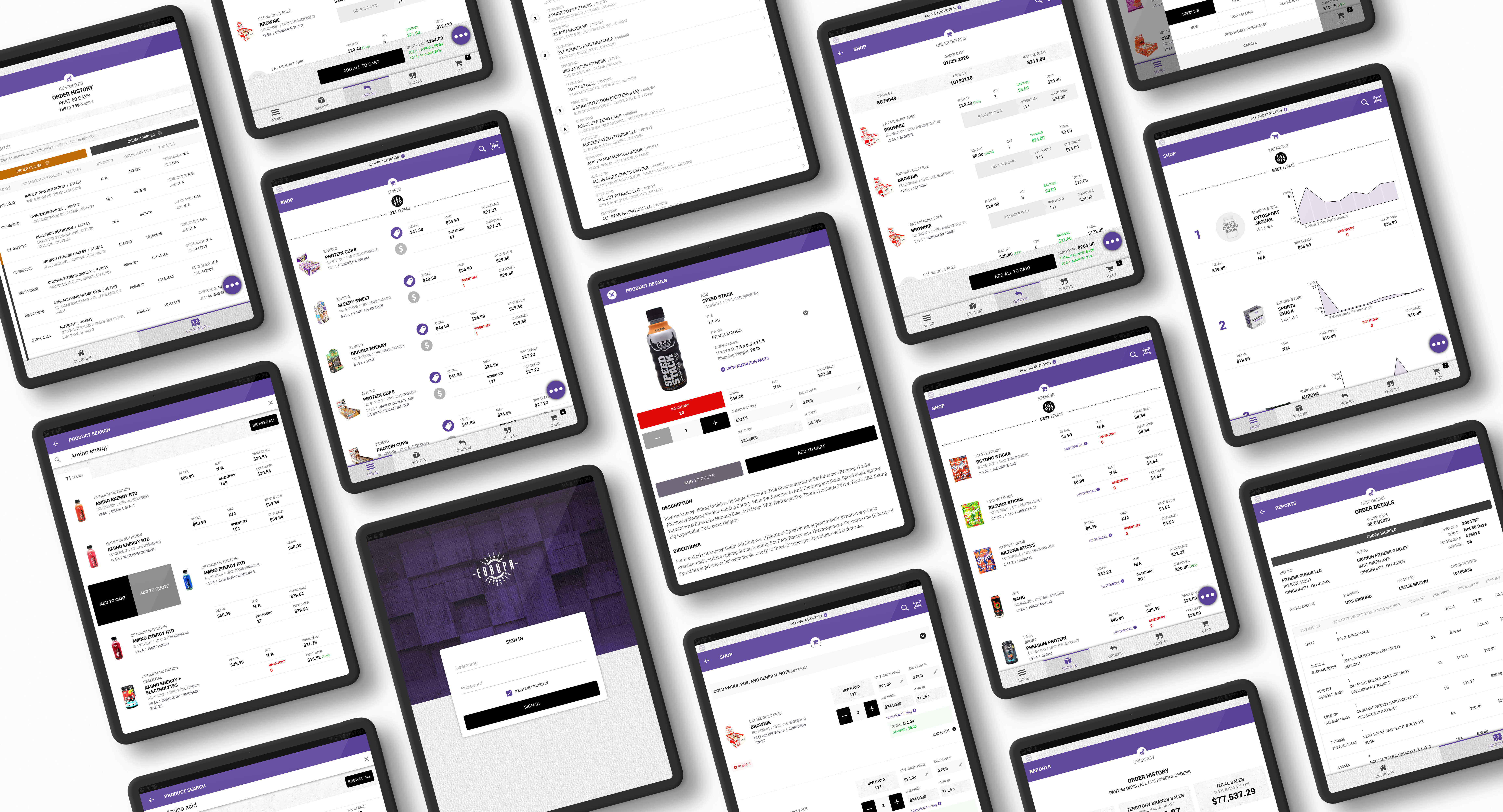
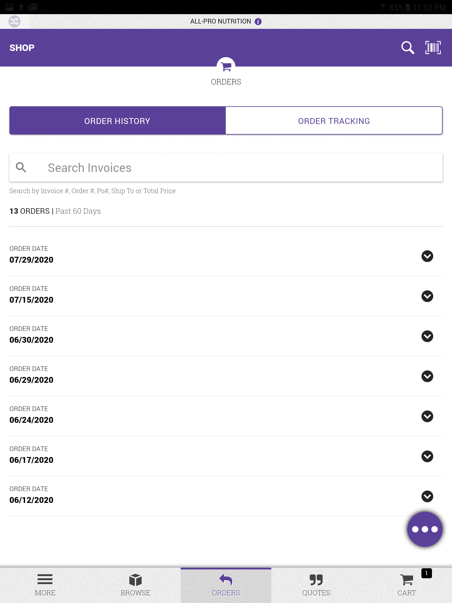 Order History
A listing of all orders placed within the past 60 days.
-
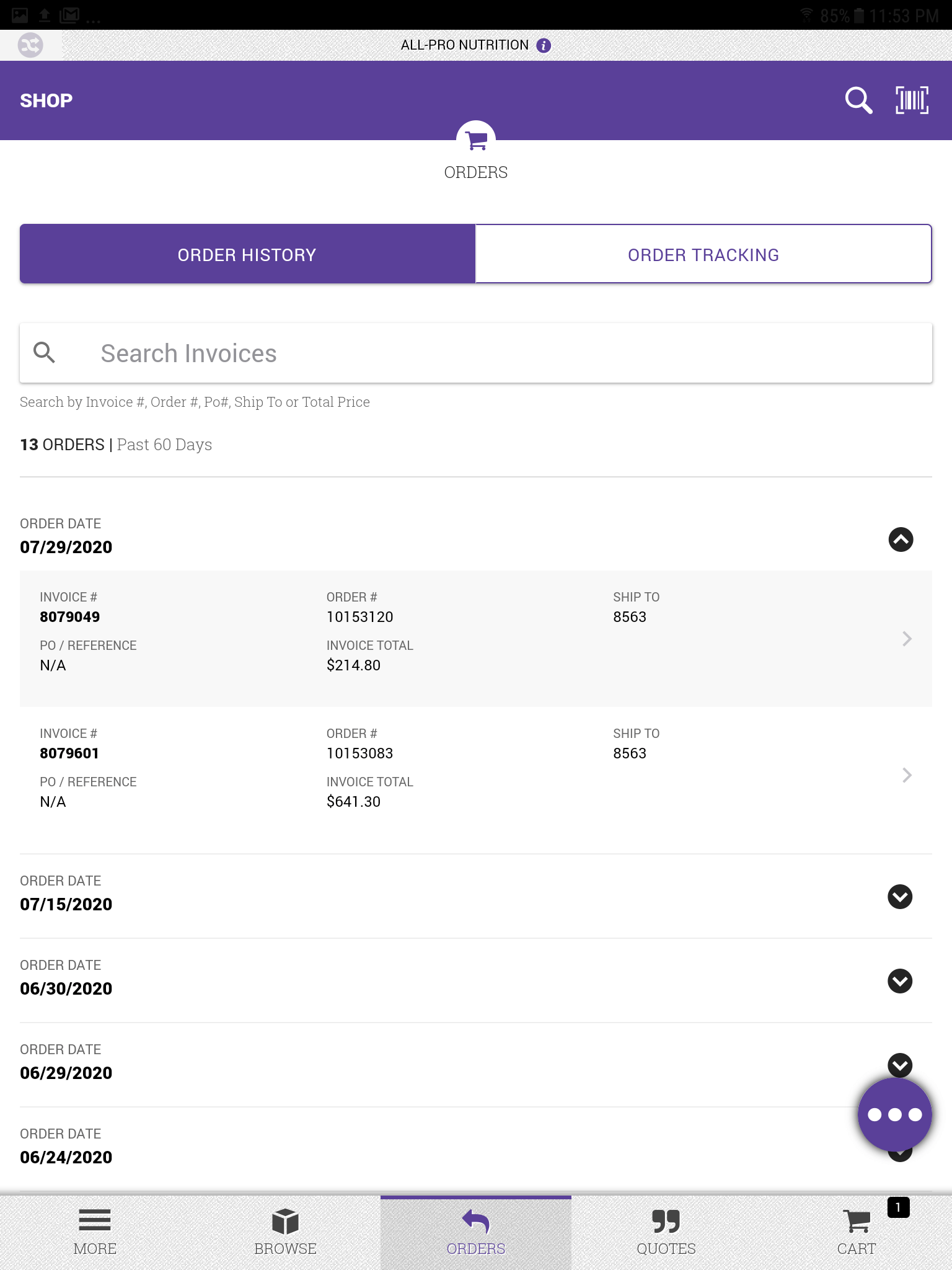 Order History: Order Selected
A listing of all orders with one selected.
-
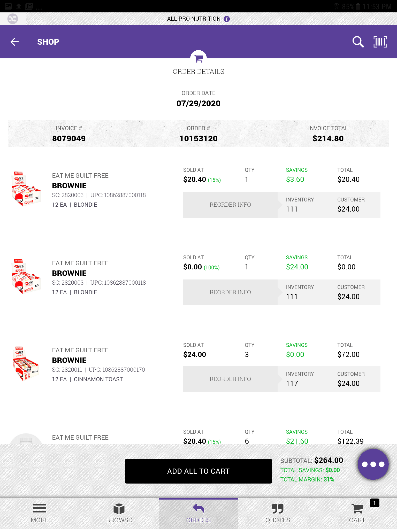 Order History: Order Detail
All the information about the order.
-
 Main Menu
Main menu after clicking the meatball menu button.
-
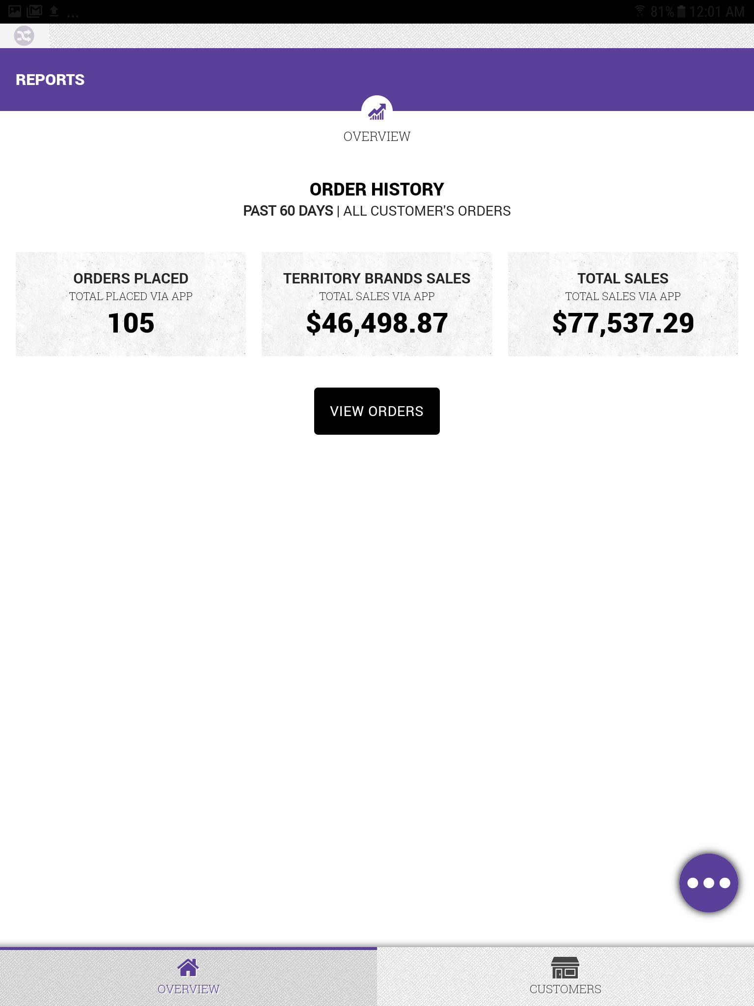 Reports Overview
Simple orders overview for all customers.
-
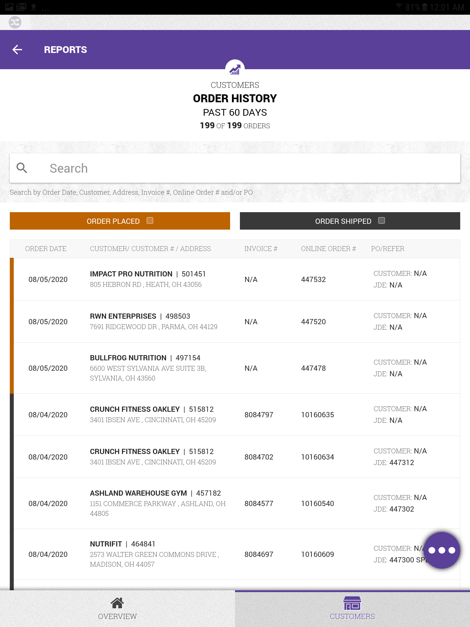 Reports: All Customer's Order History
A listing of all customer's orders within the Reports section.
-
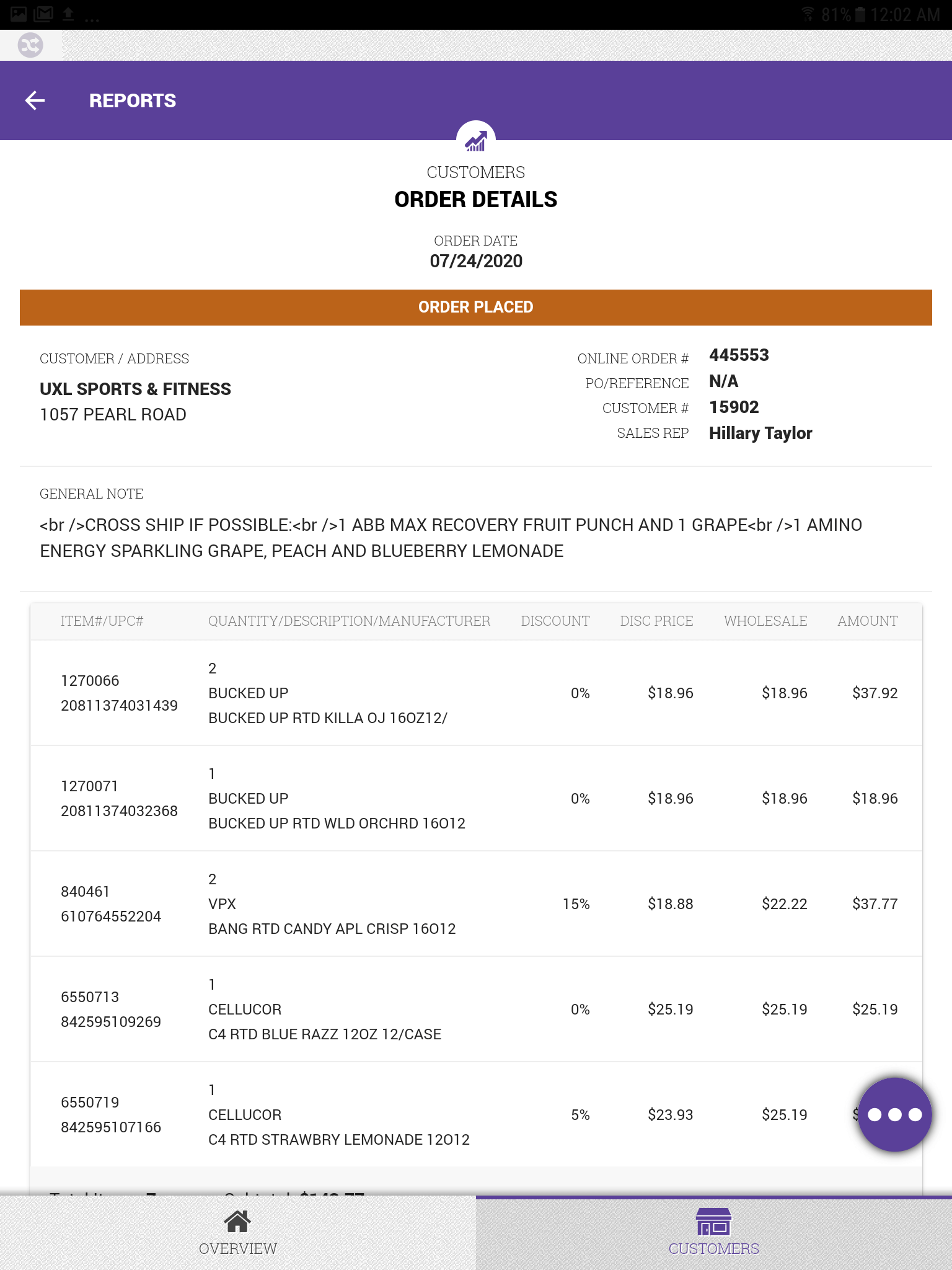 Reports: Order Details
All the information for a customer's order details that have been placed but not processed within the Reports section.
The Challenge
Europa Sports' Territory Managers were visiting customers with nothing more than paper and pencil. When a customer wanted to place an order, the Territory Manager would write down the items by hand, then step outside to call an inside sales representative who would actually process the order in the system.
Pain Points
For Territory Managers:
- No access to real-time pricing during customer conversations
- No visibility into inventory availability; they were promising products that might be out of stock
- No order history to reference past purchases or suggest reorders
- Time wasted on phone calls that could be spent building customer relationships
An additional challenge emerged mid-project:
Budget cuts eliminated the plan to provide iPhones to all Territory Managers. We had to pivot from iOS to Android tablets, requiring us to rework the designs.
Discover
Research Approach
I approached discovery by working closely with Territory Managers from the start. Rather than making assumptions about their needs, we collaborated closely to understand their workflows, pain points, and aspirations for a better solution.
Feature Listing
Our first collaborative exercise was determine the applications features and capabilities. The Territory Managers knew exactly what they wanted. On the whiteboard we listed everything: "Inventory counts ," "product availability ," "order placement," "order history," "manipulate margins," "product information," "see what's on special," "UPC scanning," and many more.
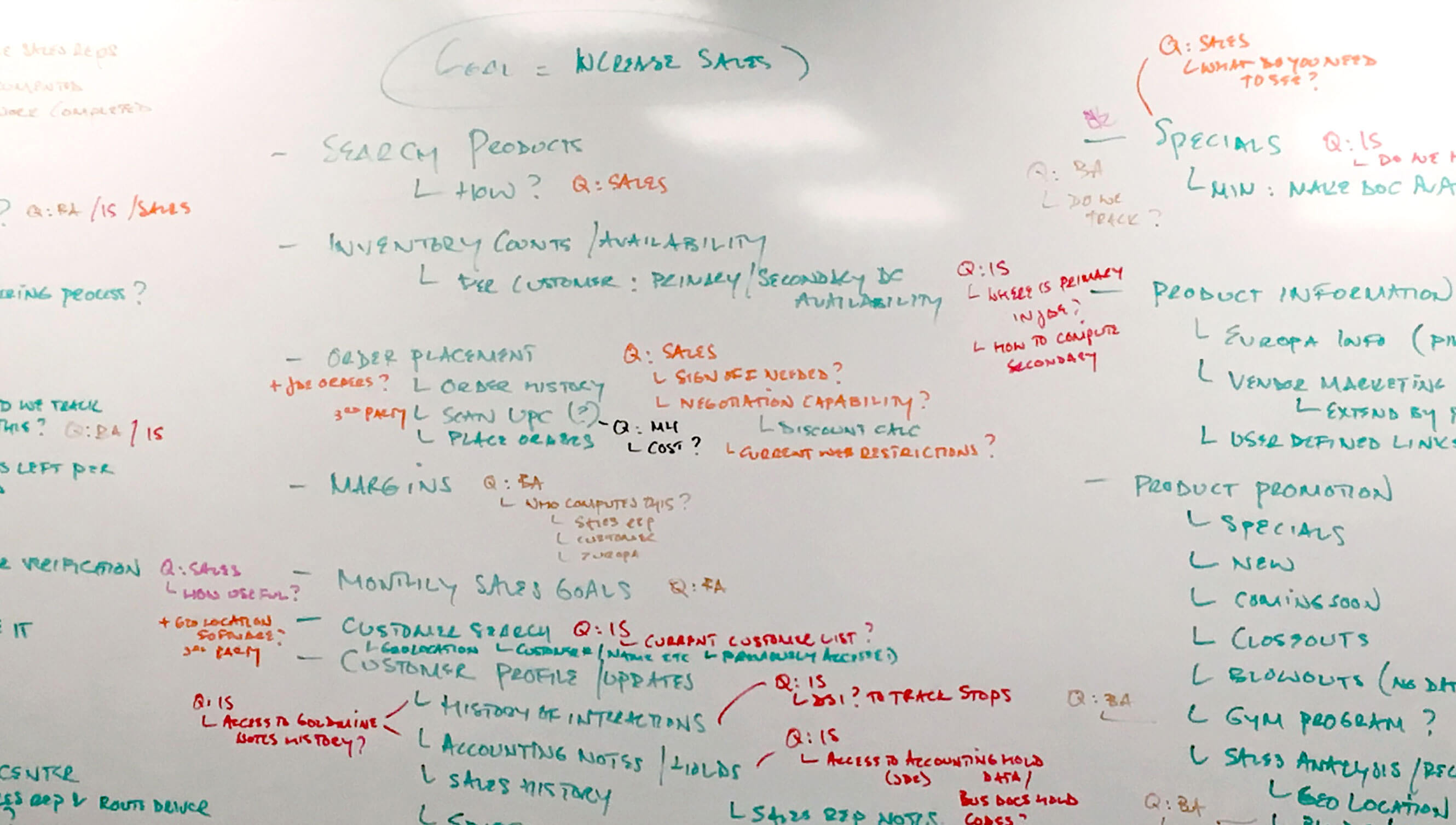
Whiteboard with all the M-Sales features listed
Role-Playing Customer Visits
Once we knew the features , I led a role playing exercise which allowed the Territory Managers to pretend they were visiting customers and step by step went through their typical interactions. This uncovered workflows and challenges we never would have uncovered through interviews alone. Such as:
- How they prepared before visiting a customer
- The types of questions customers typically asked
- How they balanced order-taking with relationship-building
- The specific information they wished they had at their fingertips
This was useful to start envisioning the user flow when accessing customer info and which UI views would be needed.
Priority Ranking
We moved to prioritizing the features. I passed out sticky notes and together, we grouped related features into logical sections and ranked them by business impact and technical feasibility. We used dot voting to identify which features would deliver the most value. This process gave us our phased roadmap:
- Phase 1 (Must-Have): Order placement and sales reporting
- Phase 2 (High Value): Customer relationship management
- Phase 3 (Important): Product promotion tools
- Phase 4 (Nice-to-have): Advanced analytics and integrations
The collaborative approach created genuine buy-in and excitement. Territory Managers felt ownership of the solution because they helped shape it from the very beginning.

Utilized sticky notes to help organize the priorities and main application sections (image a representation of actual process)
Interpret
Analyzing to conceptualize
I took all the notes from the discovery phase and mapped the information architecture. I identified four main sections that would structure the entire application:
- Order Placement - The core workflow for taking customer orders, including product search, shopping cart, and checkout
- Relationship Management - (designed for Phase 2)Tools for managing customer information, interaction history, and account details
- Product Promotion - (designed for Phase 3)Tools for managing customer information, interaction history, and account details
- Reporting & Analysis - Sales performance metrics, payout reports, and customer insights
We created detailed user journey maps for several Territory Manager personas, walking through scenarios like "visit to customer," "reorder from an existing customer," and "placing order for customer." These journeys revealed the connections between sections and helped us determine the navigation patterns.
Solve
Wire-framing
As lead designer and lead front-end developer, I sketch and wireframe at least 2-3 initial high level UI approaches that explore navigation, layout and main components. I worked with the design team to evaluate the approaches to determine the best solution.
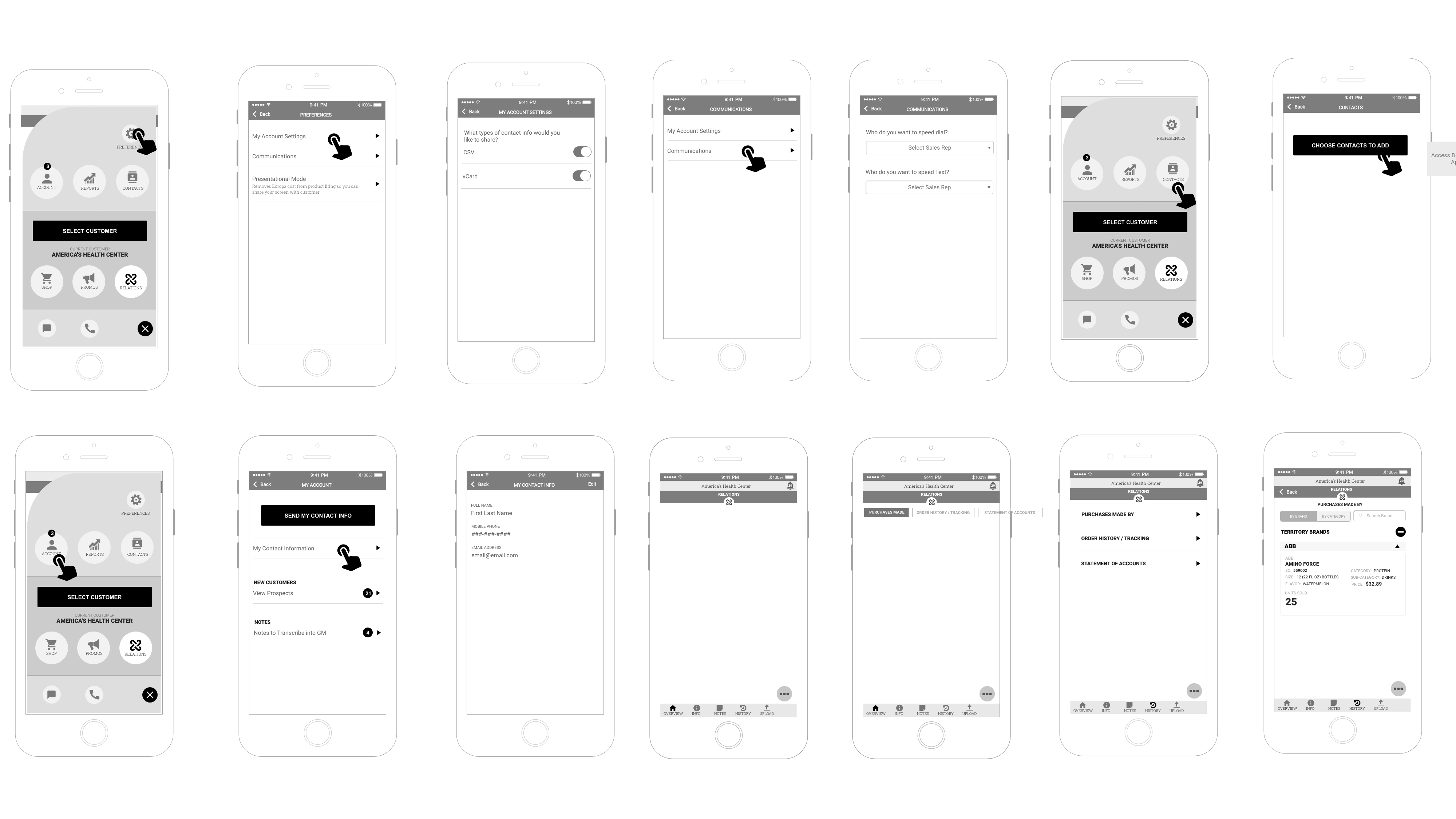
Exploring UI navigation and layout with wire-frames
During our Scrum sprint planning, I assigned the design team different areas of the experience to extend wire-frames. We created wire-frames for all four planned sections, even those planned for future phases, to ensure a cohesive long-term vision and consistent interaction patterns.
Small example of wire-frames
Evaluate
Prototyping
We built an interactive prototype using our refined wire-frames. It wasn't a fully functional app but it demonstrated how the different sections would flow. We brought the Territory Managers back for hands-on usability testing instead of showing them static screens.
Since it wasn't fully functionally, we provided them with tasks to complete. Watching them interact with the prototype revealed additional refinements we needed:
Refinement 1:
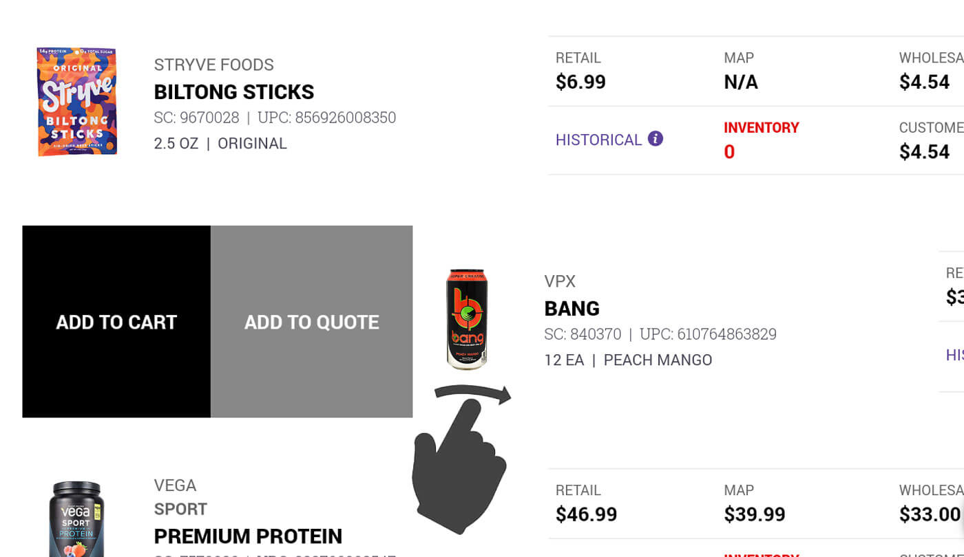
They needed a faster way to add products to the cart. The traditional press the "Add to Cart" felt sluggish so we incorporated the swipe action to add to cart.
Refinement 2:
We didn't offer enough calculations for freight charges so we added the needed data
Refinement 3:
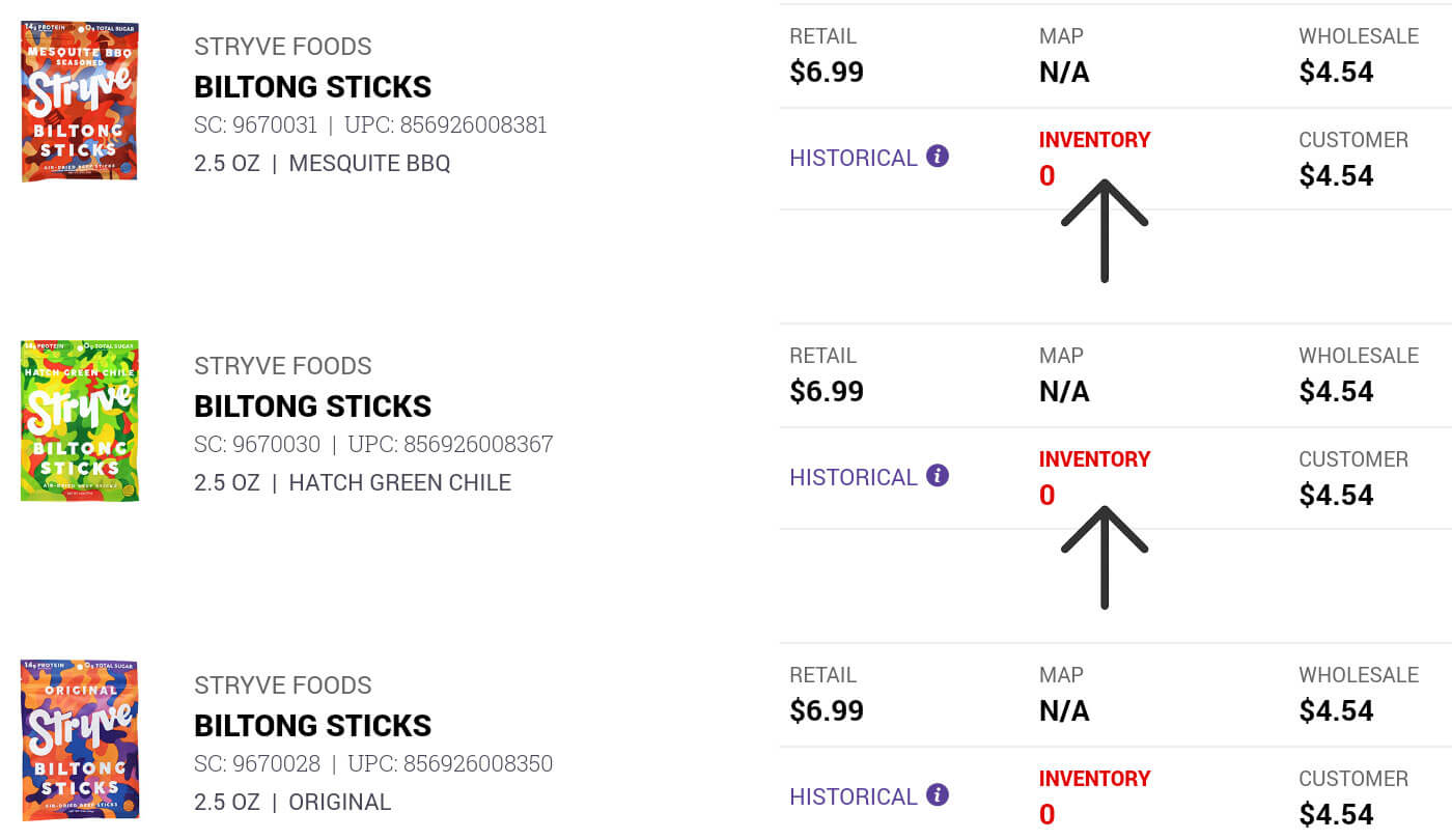
We hadn't made it easy enough to see the customers products they ordered in the past so we added a historical link at the product item level.
Implement
Design Process
*Major Challenge Introduced*
Project budget cuts eliminated the plan to provide iPhones to all Territory Managers. We had to pivot from iOS to Android tablet, requiring the design team to design mocks for tablet viewport from iOS iphone wire-frames. The functionality remain the same. I set the design standard by designing a few of the major screens and components to give the team a jumping off point.
Converting the iOS wire-frames to tablet sized Android design mocks.
Visual Design
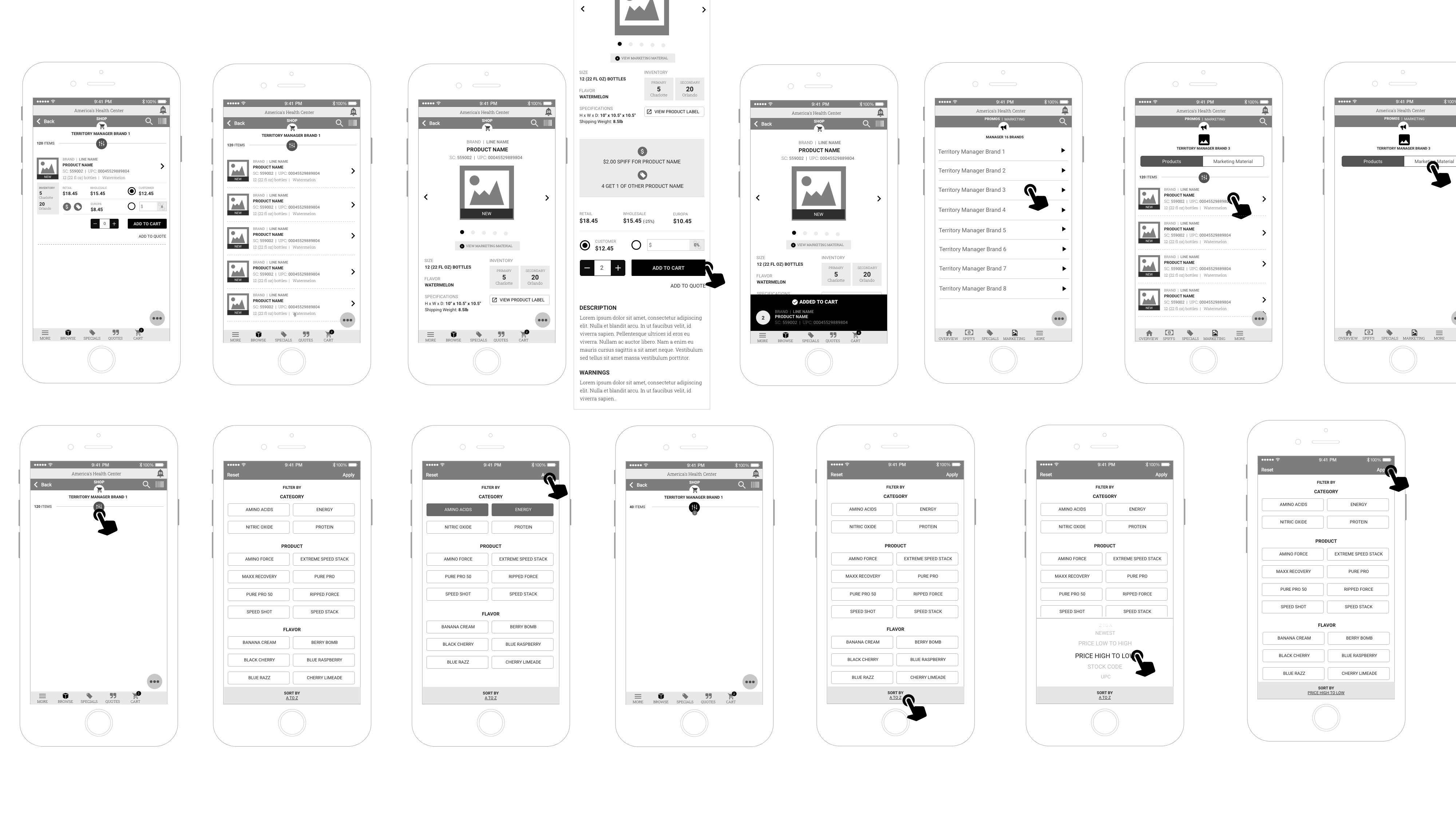
Mocks
Once the UX was validated through testing and signed of by the Territory Managers, I began designing high-fidelity mocks of the navigation, header, footer and a few of the main pages to establish a look and feel.
As a team, we designed mocks of every screen in phase 1. This process was highly collaborative. We'd meet as a team for critique sessions. We'd question design decisions, suggest refinements, and identify inconsistencies in spacing, color usage, or component styling. Through multiple rounds of feedback and iteration, we refined the look and feel until every screen felt cohesive. The design elements were defined.
A sample of the high-fidelity design mocks
Color
I developed a color palette that balanced Europa Sports' brand identity with functional communication. Color wasn't just aesthetic. It was functional. A Territory Manager could glance at the product listing and immediately understand inventory status through color coding.
Red:
Red communicacted errors but also a lack of inventory.
Orange:
Orange communicacted a pricing adjustment by the Territory Manager.
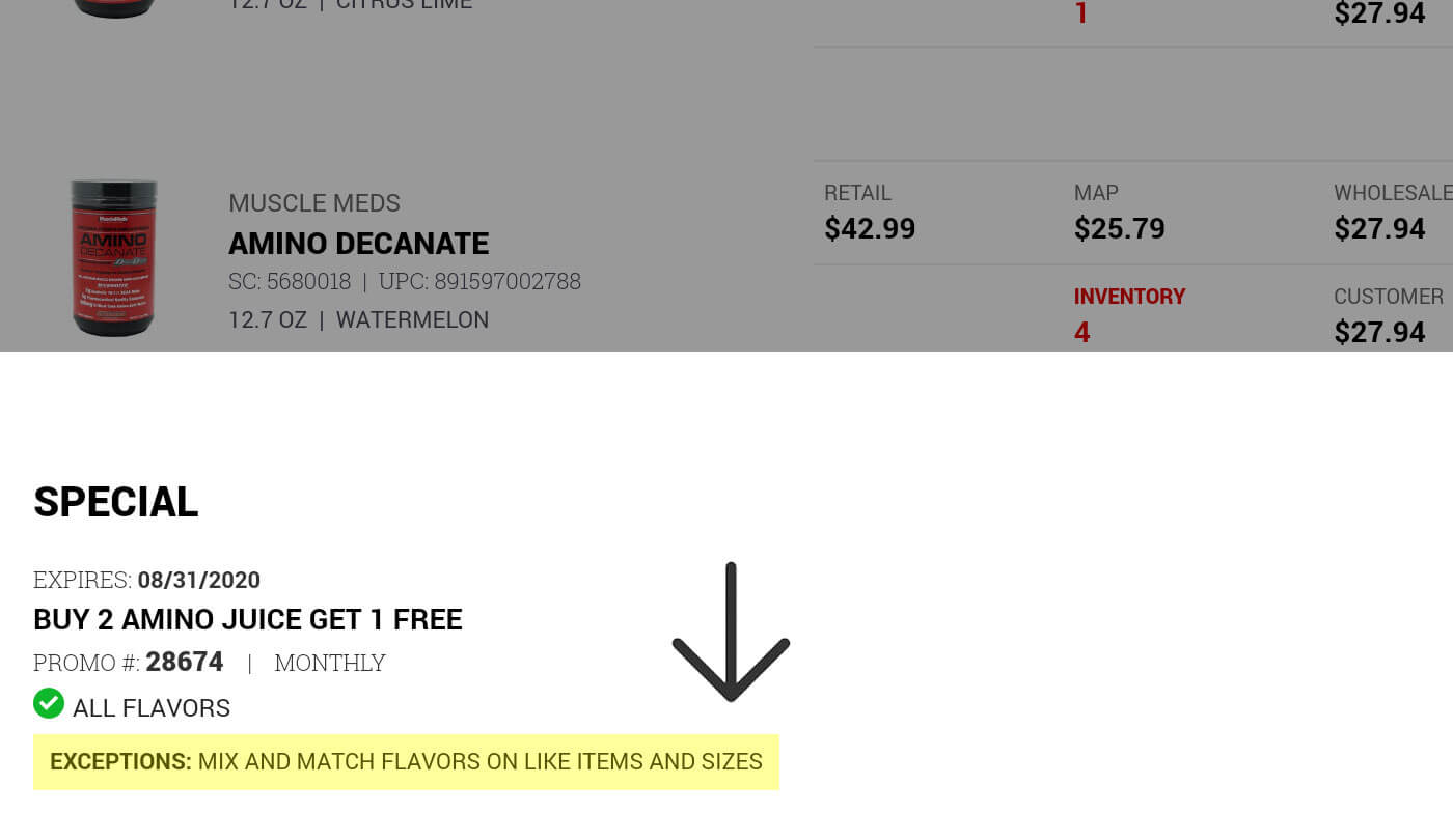
Yellow:
Yellow communicated exceptions, to be aware of, within specials and spiffs.
Typography
I used the same fonts which we used for Europa Sports' website redesign so the branding stayed consistent within all our online products. More importantly, the reasons for the font choices allowed for a clear, legible text that could be easily read in many situations and locations. The M-Sales app allowed customers to easily view the screens over the Territory Manager's shoulder within many different lighting configurations.
The type hierarchy ensured key data, such as product names, and prices were easily scannable. It also helped distinguish between different screen views like search / filter results and product details.
Iconography
The icons served as a visual language throughout the application, enabling users to quickly recognize actions, understand status, and navigate efficiently without relying solely on text. I designed the icon system to balance clarity with visual consistency. This reduced cognitive load for Territory Managers, allowing them to focus on customer interactions.
Reusable Components
The design / development teams and I devised a simple component library. We individually took the design mocks and drew outlines around the UI elements to determine a reusable set of UI components; including buttons, form inputs, product listing cards, search / filter actions ... etc., each with clearly defined states, behaviors, and styling rules. This ensured every instance of the search bar, cart item or quantity counter functioned identically throughout the application.
Defining Components:
Elements (atoms):
Individual elements of a component
Grouped Elements (molecules):
Grouped elements are the sections of the component
Component (organism):
The sections together performs the components functionality
Development
Front-End Development Process
As Lead Front-End Developer, I worked alongside the development team who were building the Vue.js framework and backend APIs. My role bridged design and development, ensuring the user experience translated seamlessly into working code.
The design team and I coded the HTML structure and CSS for all layouts, views, and UI components. Through multiple scrum sprints, the design and development teams worked in parallel.
Sprint Pattern
- We would complete HTML/CSS for a feature or section
- Developers would integrate it with Vue.js and backend APIs
- We'd conduct integration testing together
- I'd refine responsive behavior and polish interactions based on testing
After months of research, design, development, and testing, we launched Phase 1 of the M-Sales App
Solution
The M-Sales App delivered measurable business impact immediately after launch:
- More Customer Visits Per Day compared to the paper-and-pencil process.
- 60% Increase in Territory Manager Sales by eliminating time wasted on phone calls to inside sales reps.
- Improved Order Accuracy Real-time inventory data prevented orders for out-of-stock items.
- Increased Professionalism & Confidence Territory Managers could answer questions immediately, show product information on the spot, and process orders efficiently.
- Positive Customer Feedback Relationships with customers strengthened.
Key Takeaways
This project reinforced several principles that continue to guide my design work:
- When possible, involve users as partners, not just test subjects. By involving Territory Managers from day one, participating in feature prioritization, providing feedback on wire-frames and testing prototypes, we created genuine buy-in and ensured we were solving real problems.
- Design based on behavior, not assumptions. Role-playing exercises and hands-on prototype testing revealed needs we never would have discovered through interviews alone. Watching how people actually work, rather than asking them to describe it, uncovered the insights that shaped our design decisions.
- Stay flexible when constraints change. The iOS-to-Android pivot could have derailed the project. Instead, we adapted quickly, and delivered an even better solution. Flexibility is sometimes as important as design skills.
What I'd Do Differently
If I were to approach this project again, I would:
- Conduct field observations. While our role-playing exercises were valuable, I would have shadowed Territory Managers in actual customer visits before beginning design work. Seeing the real environment, the lighting conditions, in store product locations, and customer dynamics would have informed even better decisions.
- Built a true design system. We created components as needed, which worked for Phase 1. A more comprehensive system would have scaled better to the unbuilt phases.
Conclusion
The M-Sales App delivered what mattered most:
- Territory Managers increased their sales
- Visited more customers daily
- Boosted their confidence and professionalism
We focused on solving their real pain points, which included lack of access to pricing data, no inventory visibility, and time wasted on phone calls. We created a tool that generated measurable business value for Europa Sports. When you truly understand user problems and build solutions that address them directly, the impact shows up in the metrics and happier Territory Managers.
